---
title: Advanced Configuration
description: Advanced Configuration
keyword: Custom tooltip
---
import { Aside, Steps } from '@astrojs/starlight/components';
import { MediaPlayerComponent } from "../../../../components/video-player";
import RunScript from "../../../../components/RunScript.astro";
# Advanced Configuration
## Creating a View
A **View** in Infoveave works as a custom tooltip that enhances data previews, transforming standard tooltips into dynamic insights. Unlike basic tooltips, a View allows you to use interactive widgets or visualizations for deeper analysis without leaving the page.
Here is a step-by-step guide to help you configure a View for Infoboards:
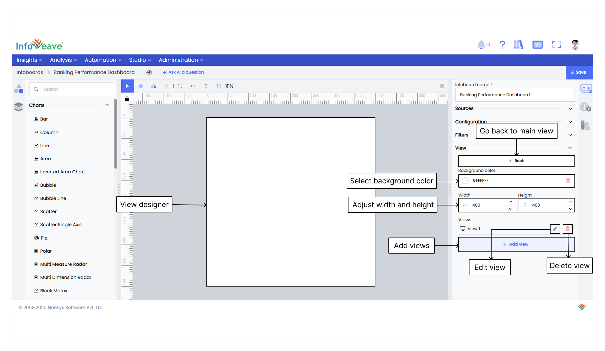
1. In the **Infoboard Setup** tab, select the **View** feature.
2. Click **+ Add view**. A new view appears with the default name View 1.
3. Select the edit icon next to the view name. This action takes you to the view designer interface.
4. Set the width and height of the view designer screen.
5. You can also choose a background color for the view.
### Configuring a View
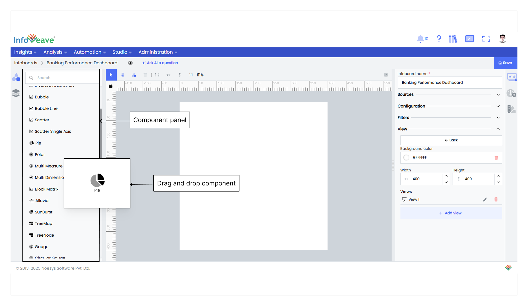
1. Drag and drop widgets onto the view designer.
2. Select the widget you want to configure.
3. Go to the **Widget Configuration** tab to set the datasource, measures, and dimensions.
4. Configure fields like Datasource, value, axis, group, and date.
5. Use the gear icon to format measures and dimensions if needed.
6. Add drill-down filters for deeper analysis if required.
7. Set fixed filters for specific dimension and measure conditions if necessary.
### Customizing a View
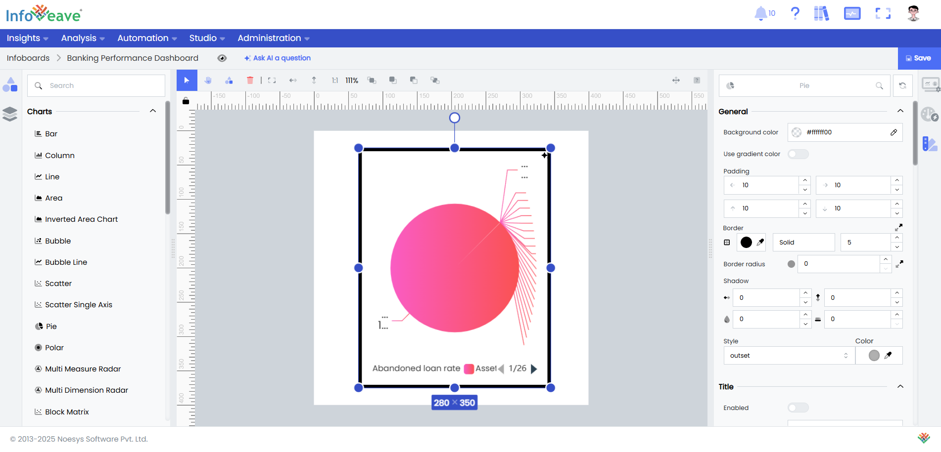
1. Select a widget on the designer canvas to customize it.
2. Go to the **Widget Customization** tab and explore options for styling, labeling, and interactivity.
3. Edit labels for axis name, value, or label.
4. Adjust the font size, style, and alignment.
5. Save changes to the widget’s appearance and behavior.
6. Click **Save** and return to the Infoboard designer.
### Linking a View with an Infoboard
1. Select the widget on the Infoboard where you want to link the View.
2. Go to the **Widget Customization** tab.
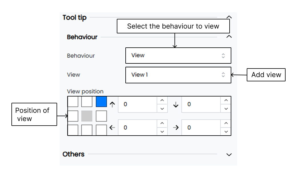
3. Find the **Tooltip** section in the customization options.
4. In the **Behaviour** setting, select **View** as the default option.
5. In the **View** setting, choose the View you previously configured. All available Views appear in the **View** list.
6. Click **Save** to apply the linked View.
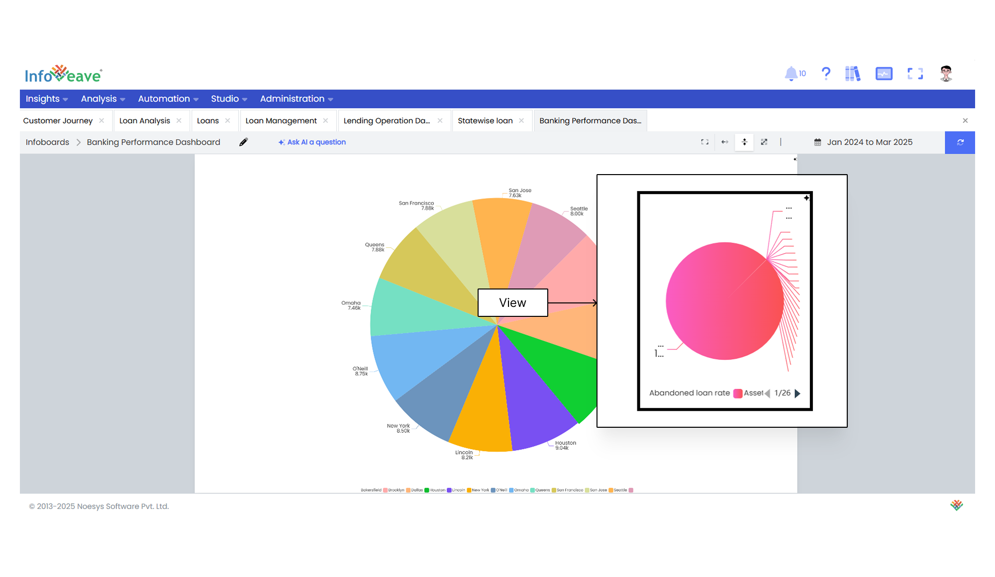
7. Hover over the selected widget to view the tooltip.
## Conditional Expressions
0.18. This condition checks if the average churn rate exceeds 0.18."
},
{
"start": 9,
"end": 18,
"text": "Configure Workflow Trigger Action",
"description": "For the first expression, select Workflow Trigger from the Widget dropdown. Ensure Visibility is toggled on. Click Edit action to define what happens when this condition is met."
},
{
"start": 18,
"end": 26,
"text": "Select Workflow to Execute",
"description": "In the Edit action dialog, choose Execute Workflow from the Actions dropdown. Then, from the Workflows dropdown, select Download Email. Keep Ask for confirmation checked, and click Save."
},
{
"start": 26,
"end": 32,
"text": "Add Second Conditional Expression",
"description": "Click Add Expression again. Enter the second expression: AVERAGE('Average ChurnRate'['Churn Rate']) < 0.14. This condition checks if the average churn rate is below 0.14."
},
{
"start": 32,
"end": 45,
"text": "Configure Green Indicator",
"description": "For the second expression, select Green Indicator from the Widget dropdown. Ensure Visibility is toggled on. Expand the General options and set the Icon size to 18. Click Save to confirm both expressions."
},
{
"start": 45,
"end": 49,
"text": "Save Infoboard",
"description": "Click the Save button in the top-right corner of the Infoboard interface to apply all changes, including the newly configured conditional expressions."
},
{
"start": 49,
"end": 68,
"text": "Apply Account Tenure Filter",
"description": "Once the Infoboard reloads, click the Account Tenure filter dropdown in the top right. From the options, select 4-5 years to filter the dashboard data. Observe the changes in the dashboard metrics."
},
]}
poster="/images/introduction-poster.png"
posterText="Setup Conditional Expressions In Infoboard"
client:load
/>
Infoboard expressions are special rules that help you create dynamic and customized data visualizations by applying conditions to widget measures and dimension values. These expressions let you control how other widgets behave and appear based on conditions, making Infoboards more interactive and visually effective.
### Expression Syntax
```
Function(,) = Conditional Value
```
Where
* `` is written as `'Widget Name'[Measure Name]` and `` is written as `[Dimension Name] = "Dimension Value"`
* `Function` represents a specific command used in data analysis.
* `'Widget Name'` uses single quotes to identify it as a string literal, typically for a widget name.
* `Measure Name` is inside square brackets to show it's a measure.
* `Dimension Name` is inside square brackets to show it's a dimension.
* `"Dimension Value"` is inside double quotes to specify a particular value.
* The operator used in the expression defines the condition and is shown here for demonstration only.
* `Conditional Value` represents the value that needs to be true for the condition to apply.
### Configuring Expressions
To set up an expression in Infoveave, go to the desired Infoboard under **Insights**.
1. Click **Configuration** under the **Infoboard Setup** tab for the selected Infoboard.
2. Select **Configure expressions**. This opens the expression editor.
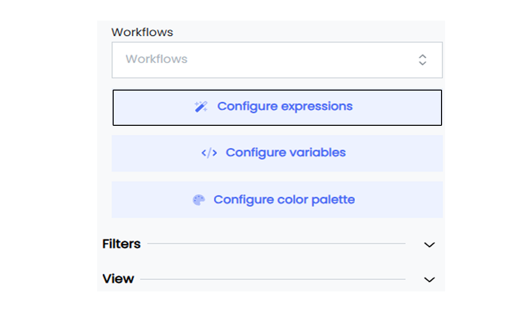
3. The editor shows any previously created expressions.
4. Click **Add Expression** to create a new one.
5. Enter your expression using the correct syntax. Define measures, dimensions, filters, calculations, and conditions. Use functions and operators available in Infoveave.
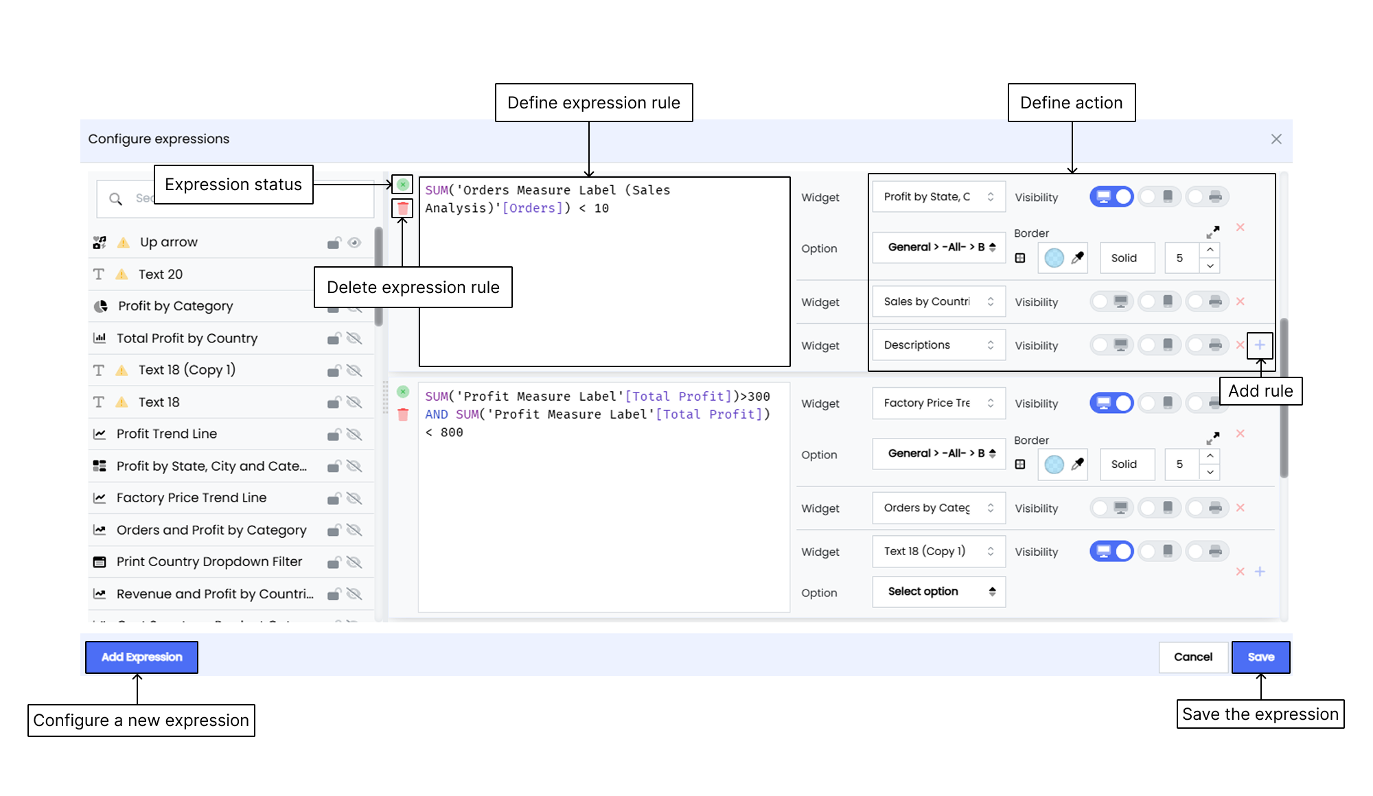
6. After writing the expression, set the **Action** that should happen when the condition is met. Actions can include changing widget properties, showing messages, or triggering other widget interactions.
7. To add another Action, click the **Add rule +** icon. You can add up to two actions for one expression.
8. Use the radio button to set the widget’s **Visibility**. Choose between **Show** or **Hide** based on your condition.
9. Assign the action to a specific Option Group. Common groups include **General, Title, Measure, and Label**.
* In the **General** group, you can customize the widget’s appearance such as background color, borders, and shadows.
* In the **Title** group, you can change title settings like text, font size, and alignment.
* In the **Image** group, you can manage image display including position and size.
* In the **Label** group, you control label display options like placement and size.
10. Depending on your selected option group, customize the action. Here's a breakdown of common action settings:
* **General**
**Background color** lets you set the widget’s background.
**Border** allows you to configure the border's color, width, and style.
**Border Radius** adjusts the corner roundness.
**Shadow** adds shadow effects.
**Theme** lets you apply a visual theme.
**Decal** adds decorative icons or elements.
**Show null values** determines if empty data appears.
* **Title**
**Enabled** toggles the title visibility.
**Label** sets the title text.
**Word wrap** allows long text to continue on a new line.
**Background color** sets the background for the title.
**Decoration** adds styling like underline or bold.
**Font family** chooses the font style.
**Font size** defines how large the title text is.
**Font color** sets the title text color.
**Alignment** places the title within the widget.
* **Image**
**Image** selects the image to display.
**Position** sets where the image appears.
**Repeat** controls image tiling.
**Size** defines the image dimensions.
11. Click the **Delete** icon to remove an expression or action.
12. Click **Save** to save the expression.
### Scenario
You manage an **Order Infoboard** in Infoveave and want to trigger an action using an Expression. In this example, if the total number of online orders for Brazil is less than 150, a specific action should be triggered.
**Contextual information**
Your dataset in the **Order Infoboard** tracks **Online Orders** using the `[Orders]` measure and `[Country]` dimension, with the value "Brazil" as the focus.
**Configure Expression**
Here's how you define the expression
```
SUMX('Online Orders'[Orders], [Country]="Brazil") < 150
```
This checks if the sum of online orders in Brazil is below 150.
To trigger an action such as changing the background color of the **Online Orders** widget:
* Choose the **General** option group because you're adjusting the widget’s appearance.
* From the **General** options, select **Background color** to apply a new background color when the condition is met.
By choosing the correct option group and action, you define how the widget responds to your condition.
Expressions let you control how widgets behave and appear, helping your Infoboard share meaningful insights and highlight important information effectively.
## Configuring a Color Palette
The Infoveave color palette lets you customize the appearance of your data. You can assign specific colors and icons to individual dimensions and measures. This improves readability and ensures consistent visual representation across all widgets in the Infoboard.
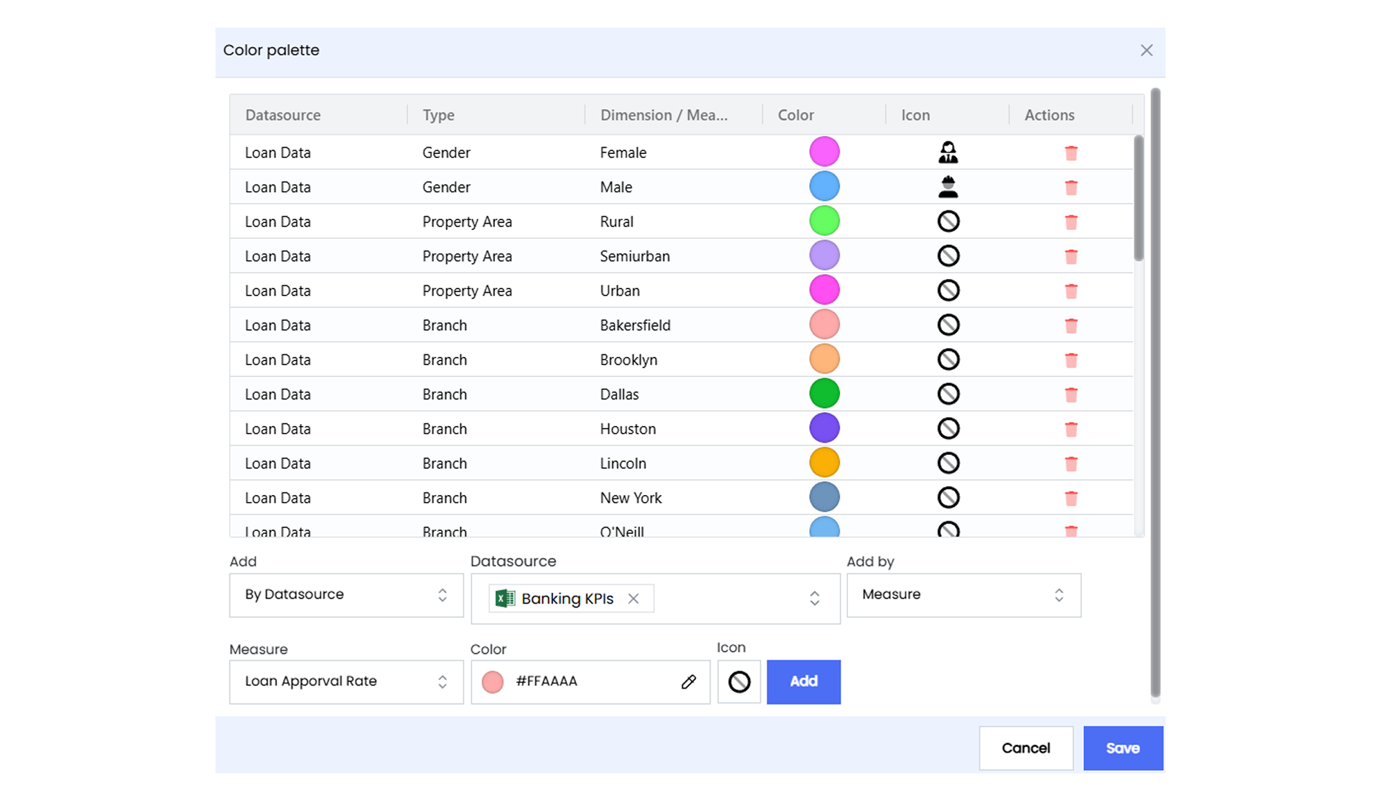
Follow these steps to configure a color palette.
1. Open the Infoboard where you want to add a color palette and click on the **Edit** option.
2. Go to the **Infoboard Setup** tab under the **Customize** panel to access color palette options.
3. Under the **Configuration** option, click on the **Configure color palette** button. This opens a modal where you can define colors and icons for specific dimensions or measures. You can also view existing palettes.
4. Choose the required Datasource from the available list.
5. Select either **Dimension** or **Measure** from the **Add by** options.
6. Pick the dimension or measure for which you want to define a color.
7. Select the specific item to which you want to assign a color and icon.
8. Select the desired icon from the Infoveave icon library.
9. Pick a color using the color picker or enter a color code.
10. Click on the **Add** button to assign the color and icon to the color palette.
## Managing Infoboard Layout
Infoveave lets you arrange your Infoboard layout for optimal presentation. You can use drag-and-drop to move and resize widgets for desktop, tablet, or smartphone views.
To manage your Infoboard layout
1. Go to the **Insights** module.
2. Choose the Infoboard whose layout you want to update.
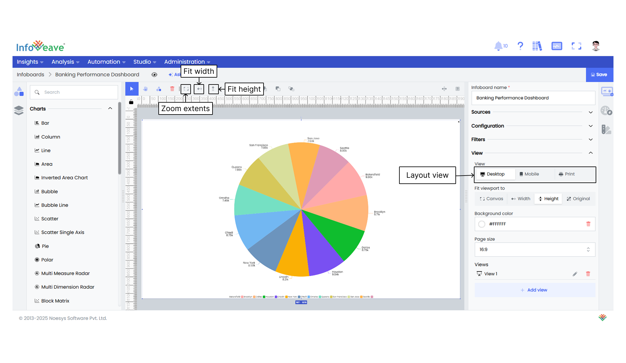
3. Click the **Edit** icon to enter editing mode.
4. In the editing view, find layout settings under the **Infoboard Setup** tab in the **View** section.
5. Select the layout type you need. Choose between Desktop, Mobile, or Print.
6. Make the necessary layout adjustments.
7. Click **Save** to save your updated Infoboard layout.