
Component Panel
The Component panel in Infoveave Designer is your central hub for adding and managing widgets on the Infoboard canvas. You use it to arrange widgets and control their visibility through layer management. The panel includes two tabs - the Component tab and the Layers tab. The Component tab lists all the available widgets in Infoveave. The Layers tab helps you group and arrange widgets on the Infoboard.
Components (Widget)
The Components tab allows you to add and manage widgets on the Infoboard canvas.
Adding widgets
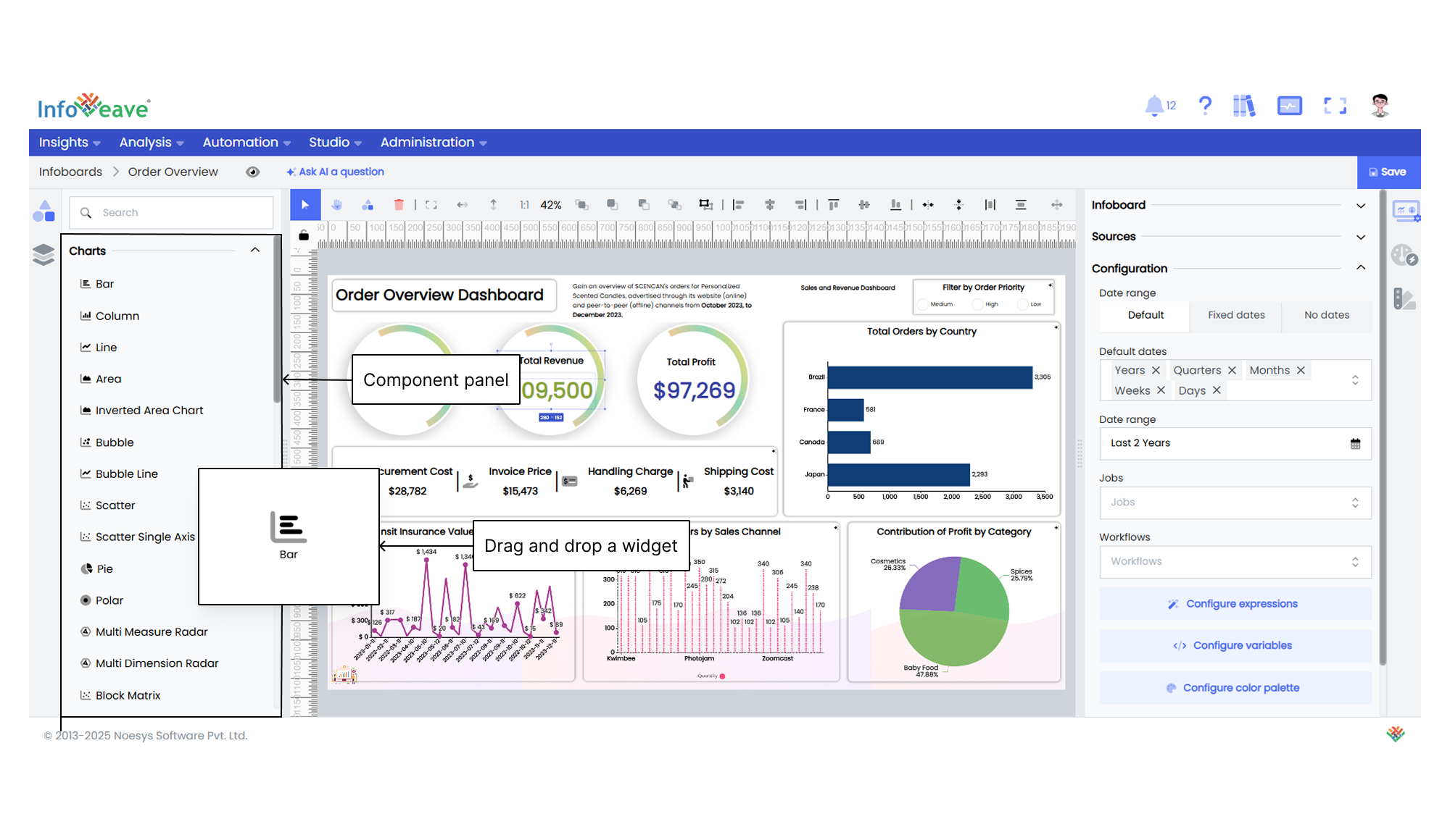
The Component panel offers a variety of widgets. To add a widget to the canvas, you follow these steps
- Browse through the tab to find the widget that suits your needs.
- Drag and drop the required widget onto the canvas.
- Position and resize the widget on the canvas as needed to create your desired layout.
Layers (Widget layering)
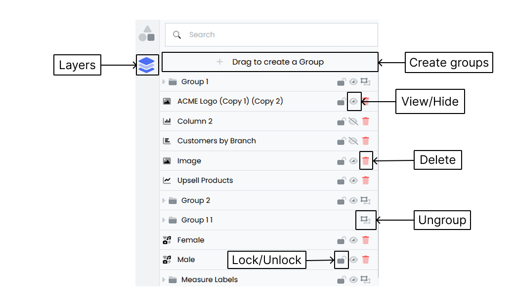
The Layers tab provides essential tools to manage and organize the elements in your design. Below is a detailed explanation of the available features and options.
Layer list
- The Layer list shows all the elements or objects in your design.
- Each layer represents an individual element such as shapes, images, text, or charts.
- Layers appear in the order they are added and reflect the arrangement of elements on the canvas.
Visibility
- Each layer has a visibility toggle shown as an eye icon that lets you show or hide a specific element .
- Click the eye icon to toggle a layer’s visibility.
- Hidden layers are not visible on the canvas but remain in the layer hierarchy.
Layer order
- The layer order controls how elements stack on top of each other.
- To change the order, click and drag a layer up or down in the list to adjust its position.
Renaming layers
To rename a layer, double-click the layer name in the Layer list. This lets you change the component name.
Grouping widget layers
- Grouping widget layers helps you organize design elements more efficiently
- Select the widget.
- Drag and drop to create a group.
- You can create multiple groups.
- Grouping makes it easier to align, resize, and move widgets together.
- Select the Group option that appears when selecting a widget in the Layout panel to create a group.
- Alternatively, click the + icon to add a new group or move a widget into the create group area at the top of the section.
- Grouped layers can be managed and manipulated as a single unit.
Locking layers
- Locking a layer prevents accidental changes or selections.
- Click the padlock icon next to the layer’s name to lock it. Use the same icon to unlock it.
- Locked layers cannot be edited until they are unlocked.
Deleting layers
- To remove a layer from your design, select it and click the trash can icon or press the delete key on your keyboard.
- Deleting a layer permanently removes it along with its content.