
Scatter Single Axis
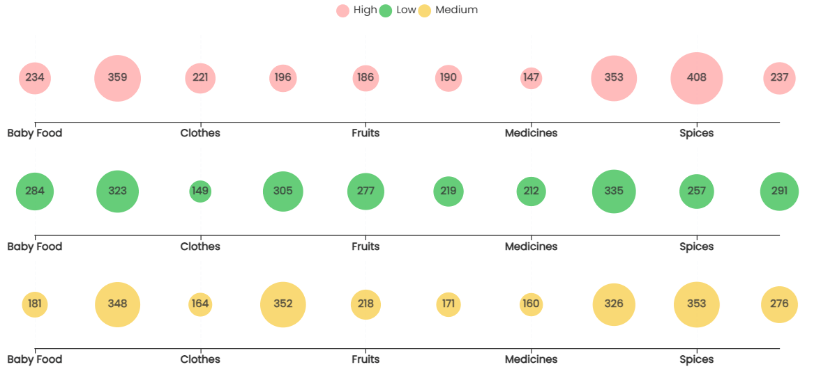
A scatter single-axis chart allows you to draw the relationship between two-dimensional values under Axis and Group against a single-measure value. The chart allows us to evaluate the relationship with dates and capture trends over time. In comparison with the normal scatter chart, where two measure values are compared over a single dimensional value, the scatter single axis supports the comparison of two dimensional values against a single measure value. The chart generates multiple-dimensional axes based on the group by value to showcase the dimensional values on the axis. It allows you to perform a direct and easy comparison of the axis values against grouped values over the selected measure. A scatter single-axis chart allows you to perform comparison, correlational analysis, pattern, trend, and outlier detection.
Scatter Chart
Basic Configuration
Add and configure the scatter single axis chart in Infoveave with the simple drag-and-drop option. Select the Datasource, the associated measure and the dimensions required. Below are the simple steps on how to configure a scatter single axis chart in Infoveave.
- Drag the scatter single axis chart and drop it onto the designer workspace, from the chart library.
- Click on the scatter single axis chart in the designer to select it.
- With the scatter single axis chart selected, go to the Widget Configuration tab located in the Customize panel.
- Under the Configuration tab, select the Basic Configuration option to access the essential settings for the scatter single axis chart.
- Select the Datasource from Source which the chart will pull the data from the option.
- Choose the Measure(s) that represents the numerical values you want to display on the scatter single axis chart.
- Choose the Dimension(s) that represents the categorical values you want to display on the scatter single axis chart.
- Use the Date (optional) to include a date dimension in your chart, useful for showing trends over time.
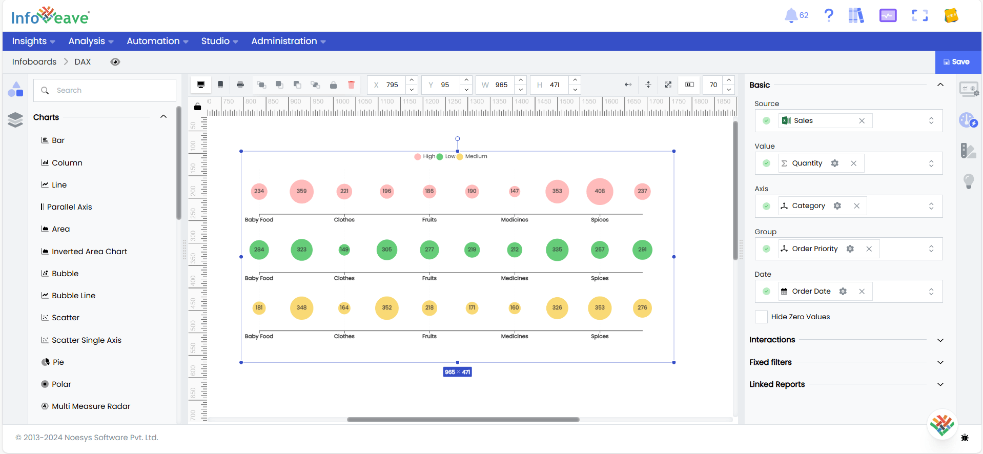
- Enable Hide Zero Values option (optional) to hide data points that have a value of zero.
Chart Customization
Customizing the line/area chart allows you to tailor the widget appearance to meet your theme. With improved customization you can enhance the clarity on the data points, the chart aesthetics and set interactivity filters making your dashboard visually appealing also effectively communicating your data insights.
With the scatter single axis chart selected, go to the Widget Customization tab located in the Customize panel.
The basic customizations available for the bar/column chart are as below
- General Modify the chart’s general appearance, including the background color, borders, shadows, and drill-out choices.
- Title Enable and customize the chart title’s text, font, color, and alignment.
- Sorting Choose the order in which data points are shown in the chart.
- Grid Customize the visibility and style of grid lines and margins in the chart.
- Axis Set up the categorical axis, including labels, intervals, and range sliders.
- Legend Adjust the legend’s visibility, position, text, and orientation, as well as heatmap settings.
- Series Customize the look and behavior of the data series, such as labels, colors, and backdrop.
- Tooltip Customize the tooltip settings to improve the information shown when you hover over data points.
- Others Additional options for stacking data series and displaying them as percentages.