---
title: "Polar"
description: "A circular bar chart where values are plotted on a polar coordinate system, ideal for representing cyclic patterns or comparative contributions around a circle."
group: Charts
tags: [Visualization, Chart, Dashboard, Polar, Circular, Radial, Comparative Analysis]
---
import { Aside, Steps } from '@astrojs/starlight/components';
# Polar
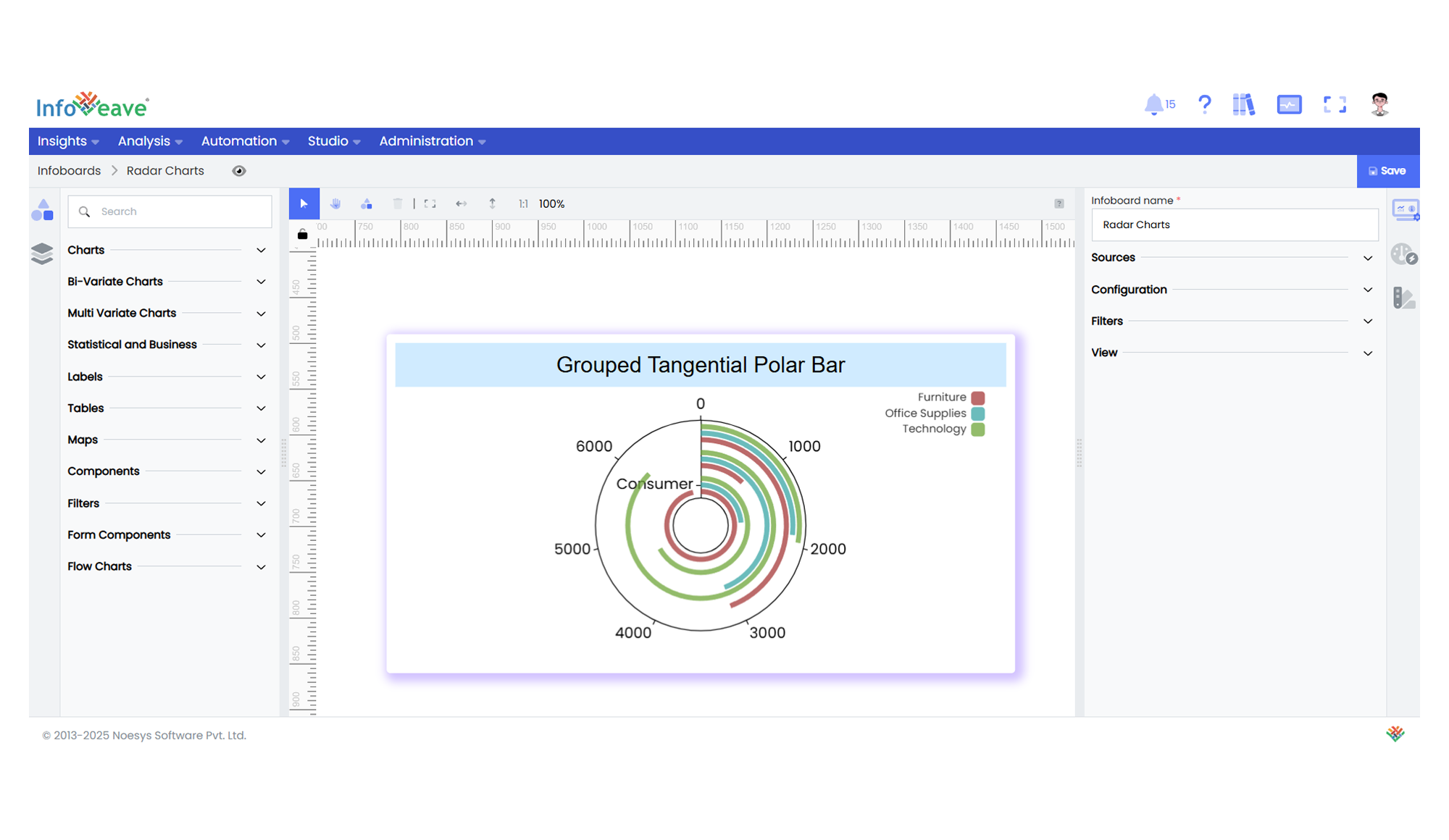
The **Polar Chart** visualizes data using bars radiating from the center of a polar coordinate system.
It’s effective for showing cyclic patterns, radial comparisons, or multi-category contributions where a circular layout is meaningful.
This chart supports both **stacked** and **grouped** configurations within the same radial axis.
**Use cases:**
- Displaying **cyclic data distributions** (e.g., time-of-day patterns).
- Comparing **category contributions** in a circular layout.
- Highlighting **radial magnitude variations** across categories.
---
## ⚙️ Setup
1. Drag the **Polar Chart** widget from the chart library onto your designer workspace.
2. Select the chart.
3. Go to the [Widget Configuration](/insights-v8/guide-to-infoboard-designer/customize-panel/configure/) tab in the Configuration panel.
4. Under the Configuration panel tab, select the [Basic Configuration](/insights-v8/guide-to-infoboard-designer/customize-panel/configure/#basic) option to access essential settings for the Polar Chart.
5. Select the [Source](/insights-v8/guide-to-infoboard-designer/customize-panel/setup/#sources) from which the chart will fetch its data.
6. Map:
- **[Measure (Value)](/studio-v8/datasources/measures-dimensions-and-hierarchies/)** — Numeric value representing the bar length along the radial axis.
- **[Dimension (Axis)](/studio-v8/datasources/measures-dimensions-and-hierarchies/)** — Categorical or sequential value determining bar positions around the circle.
- **[Group](/studio-v8/datasources/measures-dimensions-and-hierarchies/)** — (Optional) Categorical value to split the radial bars into multiple series.
7. Optionally add a **Date** field for time-based filtering.
---
## 📊 Basic Configuration
| Configuration Item | Description |
|:---------------------|:-------------|
| **[Source](/insights-v8/guide-to-infoboard-designer/customize-panel/setup/#sources)** | The data source to query for chart values. |
| **[Measure (Value)](/studio-v8/datasources/measures-dimensions-and-hierarchies/)** | Numeric value plotted along the radial axis as bar length. |
| **[Dimension (Axis)](/studio-v8/datasources/measures-dimensions-and-hierarchies/)** | Categorical or sequential value placed along the angular axis. |
| **[Group](/studio-v8/datasources/measures-dimensions-and-hierarchies/)** | (Optional) Grouping field to split the bars into multiple radial series. |
| **Date Field** (optional) | Enables date-based filtering and drilldown capability. |
---
## 🎨 Chart Customizations
| Category | Options & Description |
|:----------------------------|:-----------------------------------------------------------|
| **[General](/insights-v8/guide-to-infoboard-designer/customize-panel/customization-tab/#general)** | Theme, background, border, and interactivity options. |
| **[Title](/insights-v8/guide-to-infoboard-designer/customize-panel/customization-tab/#title)** | Chart title, font, alignment, and visibility settings. |
| **[Sorting](/insights-v8/guide-to-infoboard-designer/customize-panel/customization-tab/#sorting)** | Control sorting of category or group order. |
| **[Position](/insights-v8/guide-to-infoboard-designer/customize-panel/customization-tab/#position)** | Adjust horizontal and vertical positioning of the polar within the chart. |
| **[Legend](/insights-v8/guide-to-infoboard-designer/customize-panel/customization-tab/#legends)** | Show/hide, position, and format for series legends. |
| **[HeatMap](/insights-v8/guide-to-infoboard-designer/customize-panel/customization-tab/#heatmap)** | Apply color gradients based on value ranges. |
| **[Radius Axis](/insights-v8/guide-to-infoboard-designer/customize-panel/customization-tab/#categorical-axis)** | Customize angular axis labels and intervals. |
| **[Angle Axis](/insights-v8/guide-to-infoboard-designer/customize-panel/customization-tab/#numerical-axis)** | Adjust radial axis scale, formatting, and log scale. |
| **[Series](/insights-v8/guide-to-infoboard-designer/customize-panel/customization-tab/#series-customization)** | Control bar fill color, stacking, labels, orientation, and spacing. |
| **[Tooltip](/insights-v8/guide-to-infoboard-designer/customize-panel/customization-tab/#tooltip)** | Tooltip content, format, and triggers. |
| **Others** | Control **Radius**, **Inner Radius**, and whether series are **Stacked**. |
---
## 📊 Example Visualization