---
title: Widget Customization
description: Customize Infoveave widgets with flexible options for styling, labeling, and interactivity. Tailor your Infoboard design to match your data visualization needs with detailed step-by-step guidance.
---
import { Aside,Steps } from '@astrojs/starlight/components';
import { MediaPlayerComponent } from "../../../../../../components/video-player";
import RunScript from "../../../../../../components/RunScript.astro";
# Widget Customization
The **Widget Customization** tab in Infoveave enables you to tailor the appearance and behavior of widgets to suit your specific data visualization and analysis needs.
To customize widgets in Infoboard Designer, follow these steps.
1. Select the widget you want to customize on the designer canvas.
2. Explore the available customization options, which include:
**Styling** lets you adjust colors, fonts, borders, styles and backgrounds.
**Labeling** allows you to modify labels and captions.
**Interactivity** lets you enable or disable tooltips and click-actions.
3. Save the customization settings to finalize the widget’s appearance and behavior.
To assign specific colors to dimensions and measures across the Infoboard, visit [Configuring the Color Palette](/insights-v8/guide-to-infoboard-designer/customize-panel/setup/#configuring-the-color-palette)
The most common fields used for widget customizations are listed below.
---
## General
Infoveave allows you to personalize the appearance of your widgets through the **General** customization options. These include setting background colors (solid or gradient), adjusting border styles and border widths, configuring the border radius for rounded corners, and adding shadows with offsets and blur effects. You can also choose to display or hide null values in your widget.
To customize the general appearance of a widget in Infoveave, follow these steps.
**Background color of a widget**
1. Select the desired widget.
2. Under the **Widget customization** tab, click on the **General** option.
3. Set the background color of your widget using a hex color code.
4. You can also use the color picker to select any color from the screen.
5. Click on **Save** to save the changes.
**Use gradient color**
Toggle the **Use gradient** option to apply a gradient color to your widget’s background.
Define the gradient as shown in the example.
`linear-gradient (90deg, RGBA(92,124,250,1) 0%, RGBA(250,82,82,1) 100%)` creates a linear gradient from blue to red.
**Padding**
Adjust the top, left, right and bottom padding of the widget.
**Border**
Use the border option to apply a gradient color to the widget’s border.
**Style** lets you select the border style such as Solid, Dashed or Dotted.
**Width** sets the border width in pixels. For example, 0 for no border.
**Border Radius** lets you round the corners of your widget. For example, 0 for sharp corners.
**Shadow** Set the shadow for the widget for an enhanced effect.
- **Horizontal Offset** sets the horizontal shift of the shadow. For example, 0 for no horizontal shift.
- **Vertical Offset** sets the vertical shift of the shadow. For example, 0 for no vertical shift.
- **Blur Radius** adjusts the blur radius to control the shadow blur. For example, 0 for a sharp shadow.
- **Spread Radius** sets the spread radius to expand or contract the shadow. For example, 0 for no spread.
**Style Effect** lets you choose between **inset** and **outset** to define the shadow style. **Outset** gives a raised appearance.
**Shadow Color** lets you select the color of the shadow.
## Title
Customize your widget title to display relevant information and improve readability. Infoveave allows you to enable or disable the title, set the title label style and size, and wrap long titles. You can also adjust the background color, apply text styles, set the font family and size, adjust the line height, choose the font color, align the title text and add a description.
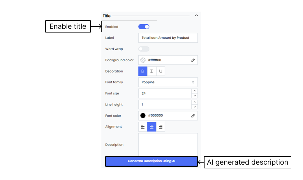
To customize the title appearance of a widget in Infoveave, follow these steps.
**Enabled** Toggle the **Enable** or **Disable** option to show or hide the widget title. When enabled, the title is displayed on the widget.
**Label** Enter the text for the widget title. For example, “Total Sales”.
**Word wrap** Enable **Word wrap** to wrap the title text onto multiple lines if it is too long to fit on one line.
**Background color** Set the background color of the title using a hex color code. For example, `#ffffff00` for a transparent background.
**Decoration** Select decorative styles for the title text such as **bold**, *italic* or underline.
**Font family** Choose the font family for the title text. For example, “Poppins”.
**Font size** Set the font size of the title text. For example, `14` for a 14px font size.
**Line height** Adjust the line height for the title text. For example, `1` for a normal line height.
**Font color** Set the font color of the title text using a hex color code. For example, `#000000` for black.
**Alignment** Choose the alignment for the title text as left, center or right.
**Description** Add a description either manually or using AI.
---
## Sorting
Infoveave’s sorting options allow you to display data effectively within widgets in a hierarchical order. This enhances the clarity of the data displayed in your widgets. You can choose dimension or measure values to be sorted in ascending or descending order.
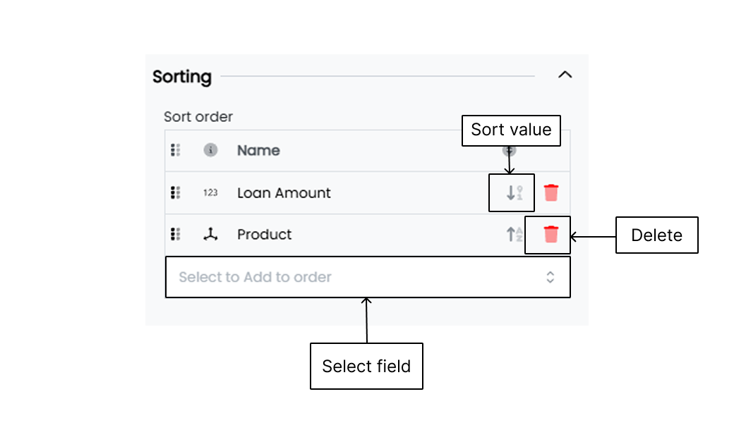
Here is how you can customize the sorting settings.
**Select to Add to order** Select the field (measures and dimensions) by which you want to sort your data.
**Delete** Delete a selected field (measures and dimensions) from the sorting order to stop the widget from sorting data based on that particular field.
**Sorting type** Change the sorting type (ascending or descending) by clicking on the sorting icon associated with the field.
## Action
The actions linked with widgets enable you to interact dynamically with your widgets, allowing for a more responsive and engaging Infoboard experience. These actions include refreshing the Infoboard to update data, navigating to another Infoboard for detailed analysis, and opening external URLs for additional resources. You can also download reports for offline analysis, trigger workflows such as data updates and report generation, and clear all applied filters to reset the Infoboard view.
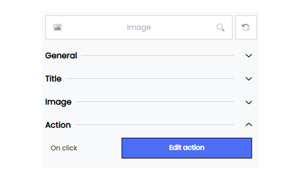
The actions linked with widgets enhance user interaction and functionality, allowing for a more dynamic and effective Infoboard experience.
To link an action with an Infoveave widget, follow the steps below.
1. Drag the required label widget type and drop it onto the designer workspace from the chart library.
2. Click on the label widget in the designer to select it.
3. With the label widget selected, go to the Widget Configuration tab located in the Customize panel.
4. Under the Widget Configuration tab, select the [Basic](/insights-v8/guide-to-infoboard-designer/customize-panel/configure/#basic) option to configure the widget if required.
5. Navigate to the [Widget Customization](/insights-v8/guide-to-infoboard-designer/customize-panel/customization-tab/) tab and select **Action**.
6. Click on the **Edit action** button and add an action to the widget.
7. Choose the required action to be linked and configure the action.
8. Click on the **Save** option to save the Infoboard.
#### Refresh Infoboard
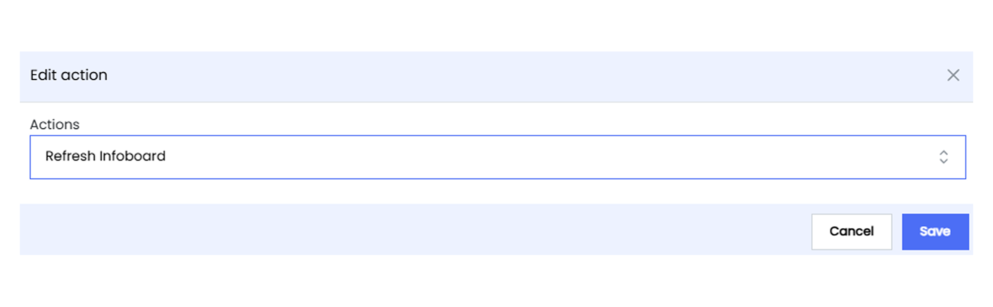
The **Refresh Infoboard** action allows you to update the data displayed on your Infoboards, ensuring that the most current information is always available. This is particularly useful for real-time monitoring Infoboards where data frequently changes.
By selecting this action, you can manually refresh the Infoboard without needing to reload the entire Infoboard, providing a seamless and efficient way to keep data up-to-date.
#### Go to Infoboard
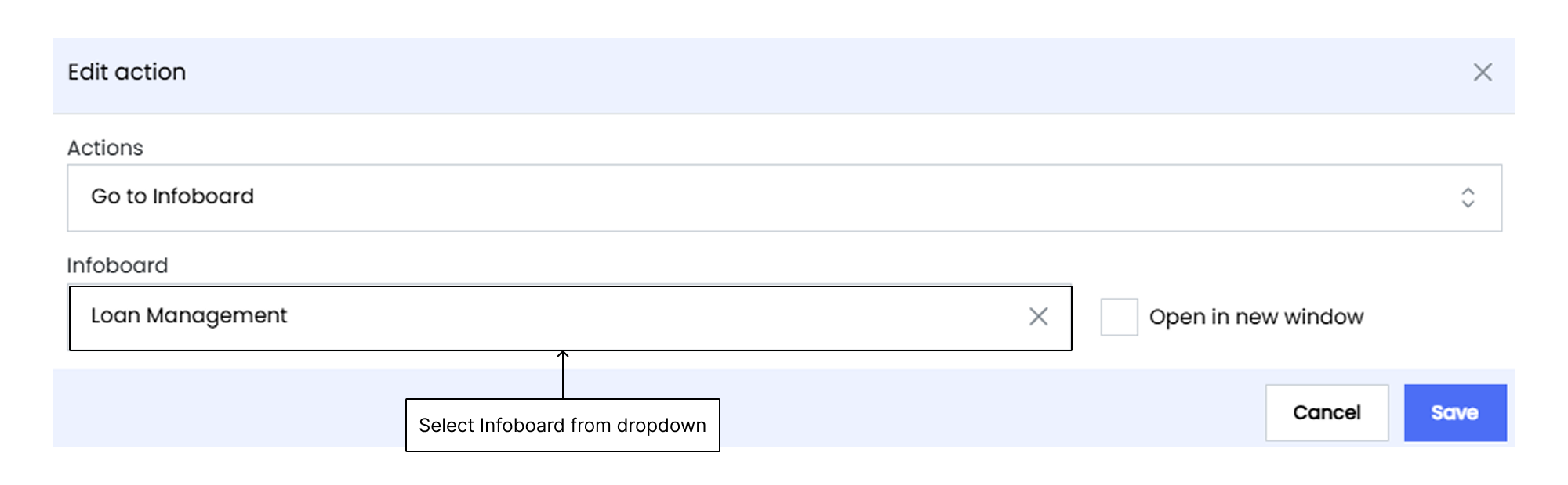
The **Go to Infoboard** action allows you to navigate to another Infoboard within the Infoveave platform. To use this action, you must select the target Infoboard from a list of predefined options, thereby enhancing data organization and exploration within interconnected Infoboard sections.
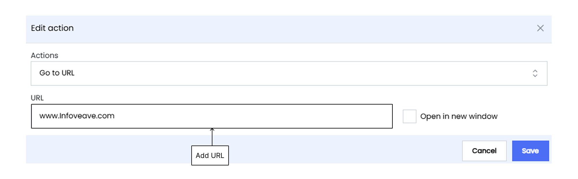
#### Go to URL
The **Go to URL** action allows you to navigate to a different URL outside the Infoveave platform. This action enables you to open an external web resource by entering the desired URL. You can choose to open the URL in a new tab for added convenience. This action is beneficial for linking to additional reports, company websites, or other relevant online tools outside of Infoveave.
#### Download Report
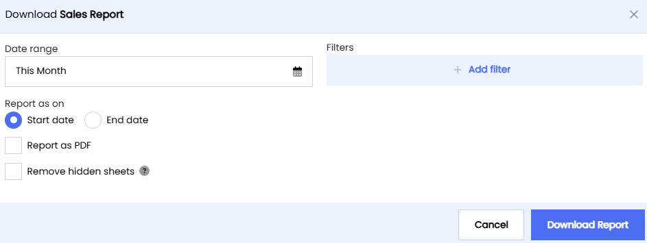
The **Download Report** action allows you to download an Infoveave report from a widget, facilitating offline analysis or record-keeping. You can select the report to download from a list of predefined options.
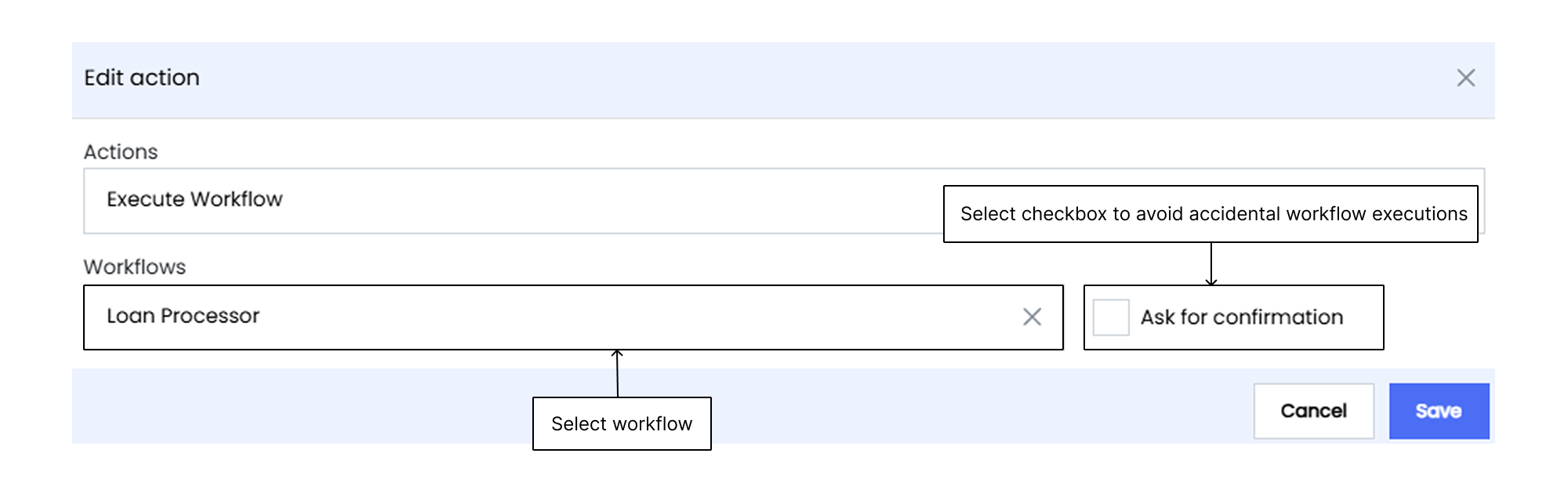
#### Execute Workflow
The **Execute Workflow** action triggers predefined workflow(s) directly from the Infoboard interface, automating activities such as data updates, report generation, or running specific data processing scripts. You must select the workflow from a list of predefined options.
#### Clear Filters
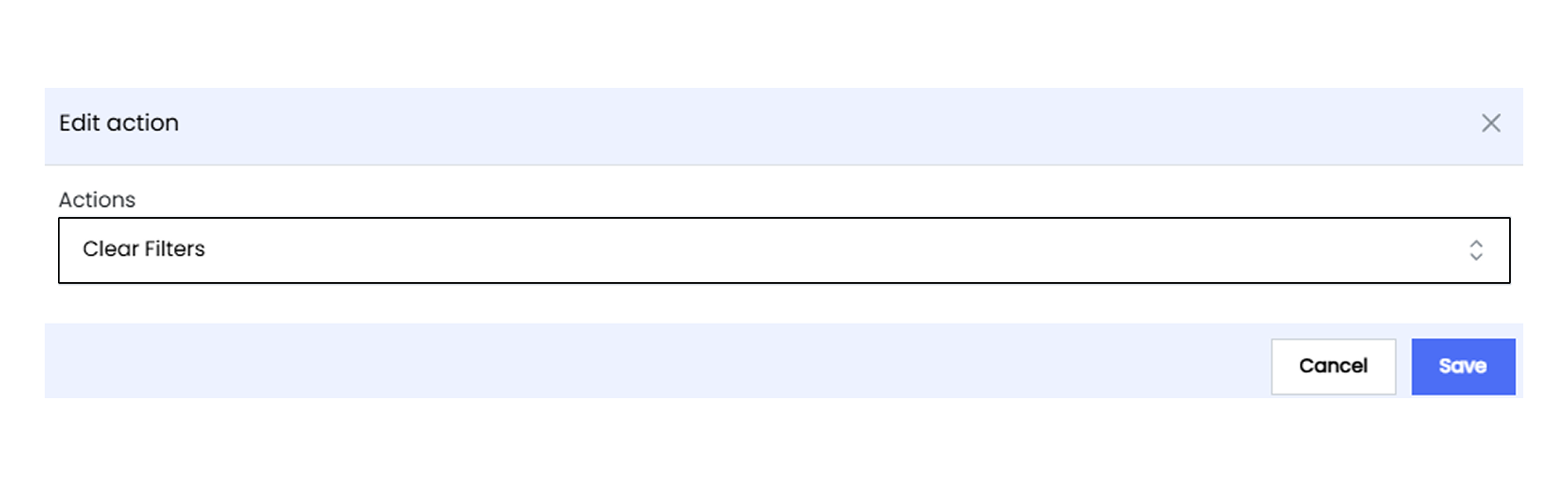
The **Clear Filters** action removes all applied Infoboard filters, resetting it to its default state. By selecting this action, you can quickly revert your Infoboard to an unfiltered state, facilitating a more flexible and dynamic data analysis process.
## Angle Axis
Angle axis customization allows you to tailor the appearance of your polar chart’s axis to better suit your data visualization needs. The customization options include enabling the display of the axis, the axis names, and split lines, all ensuring your data is presented clearly and effectively through the widget.
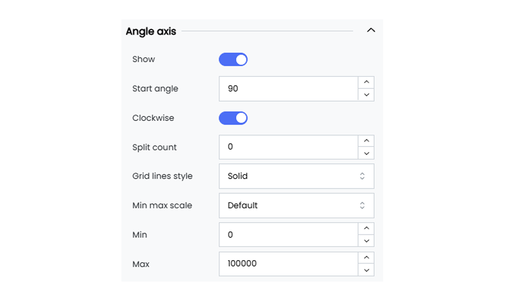
Infoveave provides the following customization options for the angle axis of your polar chart.
**Show** Enable or disable the display of the angle axis for your polar chart. When enabled, the angle axis will be visible for your widget.
**Start angle** Define the start angle value for your polar chart. The start angle value is set to 90 degrees by default.
**Clockwise** Enable or disable the clockwise rotation of the angle axis for your polar chart. When disabled, the angle axis will be rotated anticlockwise for your widget.
**Split count** Set the number of splits on the angle axis for the polar chart.
**Gridline style** Choose the style for the gridlines when enabled in the angle axis for the polar chart.
**Min max scale** Select the min and max values for the angle axis from the options data, default, and custom.
When custom is selected, use the **Min** and **Max** fields to enter the min and max values for the angle axis.
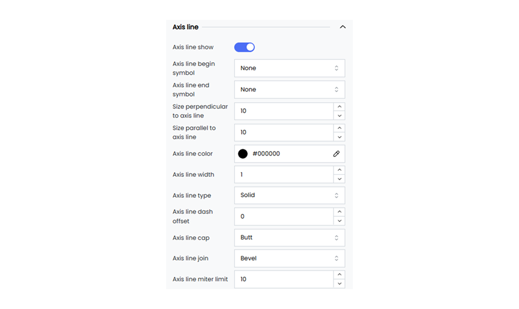
#### Axis Line
Customize the axis lines by setting their color, width, and type.
Below are the available options.
**Axis line show** Enable or disable the axis line option.
**Axis line begin symbol** Select the begin symbol for the axis line from the available options in the dropdown menu.
**Axis line end symbol** Select the end symbol for the axis line from the available options in the dropdown menu.
**Size perpendicular to axis line** Define the perpendicular size.
**Size parallel to axis line** Define the parallel size.
**Axis line color** Select the polar chart axis line color using the color picker option.
**Axis line width** Define the line width of the polar chart axis line.
**Axis line type** Choose the polar chart axis line as solid, dotted, or dashed from the dropdown options.
**Axis line dash offset** Define the axis line dash offset.
**Axis line cap** Select the axis line cap from the available options.
**Axis line join** Select the axis line join from the available options.
**Axis line miter limit** Define the axis line miter limit.
**Axis line shadow** Apply axis line shadow.
**Axis line opacity** Adjust the opacity.
## Categorical Axis
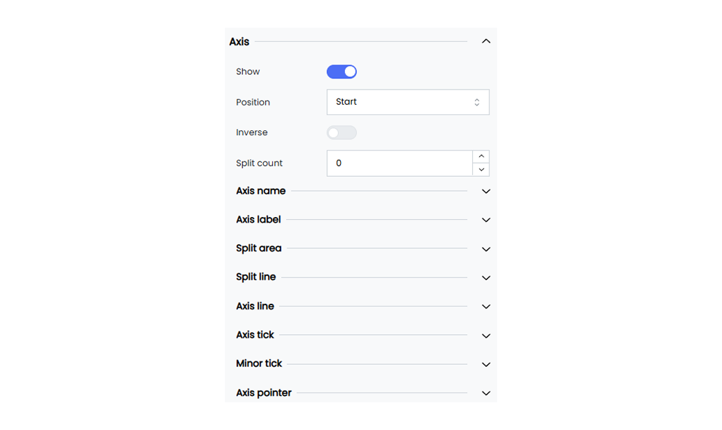
Categorical axis customization allows you to tailor the appearance of your widget’s categorical axis to better suit your data visualization needs. The customization options include enabling the display of the axis, the axis positioning, and axis label intervals, all ensuring your data is presented clearly and effectively through the widget.
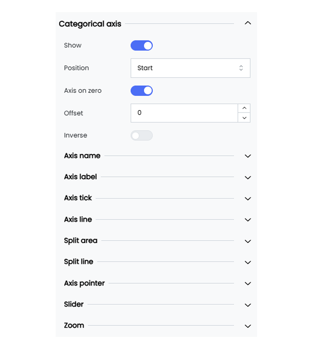
Infoveave provides the following customization options for the categorical axis of your widgets.
**Show** Enable or disable the display of the categorical axis. When enabled, the categorical axis will be visible for your widget.
**Position** Choose the position of the categorical axis (e.g., Start, End).
**Inverse** Toggle the option to invert the categorical axis direction.
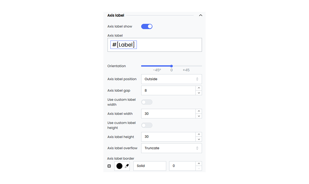
**Interval** Set the interval between axis labels as Auto, 0, 1, 2, and so on. Choose Auto for automatic spacing of your axis labels.
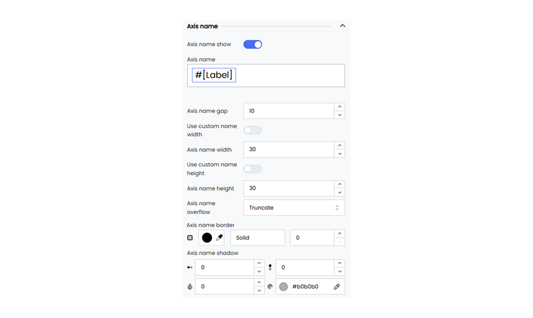
**Axis name** Give a name for the axis. By default, the axis name is set to #[Label].
- You can remove the #[Label] and replace it with the name of your choice.
- Select the name #[Label] to access options for positioning it or setting the font customization.
**Name rotate** Rotate the axis name by a specified degree with the slider provided.
**Name location** Set the location of the axis name to Start, Middle, or End.
**Name gap** Define the gap between the axis line and its name (e.g., 20 pixels).
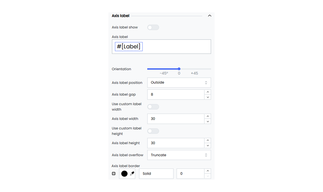
**Axis label** Enter a name for the axis label. By default, the axis label is set to #[Label].
- You can remove the #[Label] and replace it with the axis label of your choice.
- Select the axis label #[Label] to access options for positioning it or setting the font customization.
**Orientation** Rotate the orientation of the axis labels by a specified degree with the slider provided.
#### Slider
The slider enhances your widget interactivity by allowing you to focus on specific data values easily. You can enable range sliders, adjust their size, thickness, position, and colors, and even add inside zoom functionality.
Below are the available options.
**Show range slider** Enable the range slider to allow interactive range selection.
**Slider size** Define the size of the slider using the sliders.
**Slider thickness** Set the thickness of the slider (e.g., 25 pixels).
**Slider move Handle Size** Adjust the size of the slider’s move handle (e.g., 10 pixels).
**Slider position** Set the position of the slider using the position marker or the input text values (e.g., 0, 20, 0, 10).
**Slider background color** Set the background color of the slider (e.g., #ffffff00).
**Slider selected area color** Define the color of the selected area in the slider (e.g., #87afff33).
**Slider move handle color** Set the color of the slider’s move handle (e.g., #9dc9fc).
**Inside zoom** Enable inside zoom functionality for the slider.
#### Axis Pointer
The axis pointer helps you highlight specific data points. You get options to customize the axis pointer’s handle size, color, line type, width, and label settings to improve user experience.
Below are the available options.
**Show axis pointer** Enable the axis pointer to highlight specific data points.
**Axis pointer type** Choose the line type for the axis pointer from the dropdown as Solid, Dashed, or Dotted.
**Axis pointer label show** Enable the axis pointer label.
**Axis pointer handle size** Set the size of the axis pointer handle (e.g., 40 pixels).
**Axis pointer handle color** Define the color of the axis pointer handle in Hex code (e.g., #4a4a4a).
**Axis pointer line width** Set the width of the axis pointer line (e.g., 1 pixel).
**Axis pointer handle margin** Define the margin around the axis pointer handle (e.g., 40 pixels).
**Axis pointer label color** Set the color of the axis pointer label (e.g., #000000de).
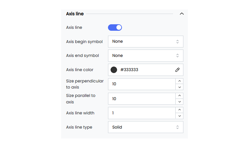
#### Axis Line

Customize the axis lines by setting their color, width, and type, and adding symbols at the beginning or the end.
Below are the available options.
**Axis line** Enable or disable the axis line option.
**Axis begin symbol** Choose a symbol to display at the beginning of the axis such as Arrow, Circle, Triangle, Diamond, or Pin.
**Axis end symbol** Choose a symbol to display at the end of the axis such as Arrow, Circle, Triangle, Diamond, or Pin.
**Axis line color** Set the color of the axis line (e.g., #333333).
**Size perpendicular to axis** Set the size of the axis begin symbol (e.g., 10 pixels).
**Size parallel to axis** Set the size of the axis end symbol (e.g., 10 pixels).
**Axis line width** Define the width of the axis line (e.g., 1 pixel).
**Axis line type** Choose the line type for the axis line as Solid, Dashed, or Dotted.
## Columns
The table column gives you options to customize your table widgets. These customization options allow you to set the table background based on the color scales, data scales, or code rules. The column customization option also allows you to add a column summary to your table widget.
Customize the table column to improve data visibility in your table widget.
Below are the customization options available for the table columns in Infoveave.
**Apply to** Select the column name to which you want to apply the column customization. By default, the label value is set to **All** to apply customization to all columns.
**Header** Select the **#[Label]** header to apply customization to the table column header.
**Wrap Header Text** Check this option to wrap the column header text within the available space.
**Value** Select the **#[Label]** value to apply customization to the table column values.
**Cell Background** Highlight your cells by applying a color scale, data bar, or code rule.
**Color Scale** The color scale option under cell background allows you to color code your cells based on their values.
**Reverse** Enable the reverse option to invert the color scale from left to right.
**Colors** To change the color scale type, click on the default color range and select the color scale type and the number of colors.
**Data Bar** The data bars option under cell background converts numeric cell values into graphical representations. The length of the bar reflects the value relative to other values in the column.
**Left/Right**
Enable or disable the option to place data bars on the left or right side of your column.
* **Reverse** Enable the reverse option to invert the color scale from left to right.
* **Colors** To change the color scale type, click on the default color range and select the color scale type and the number of colors.
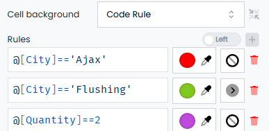
**Code Rule**
Code rules allow you to define and apply conditional formatting to table cells. To start adding conditional rules, click on the **+** icon.
* **Left/Right** Enable or disable the option to place icons on the left or right side of your column.
* **Field** Use this field to enter conditional rules.
* **Color Picker** Use the color picker to select the column background color.
* **Icon** Select the icon to add to the cell values.
**Odd row color** Set the background color for the odd-numbered rows.
**Even row color** Set the background color for the even-numbered rows.
**Aggregation function** Choose an aggregation function to apply to the column values.
**Totals** Select the **#[Label]** header to apply customization to the table totals.
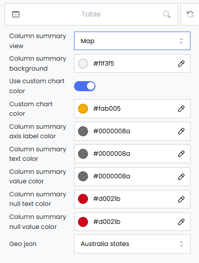
**Column summary view** Select the type of summary view for the table widget.
**Column summary background** Choose a background color using the color picker for the column summary.
**Use custom chart color** Enable the use of custom colors for charts in the column summary.
**Custom chart color** Select a custom color for charts using the color picker in the column summary.
**Column summary axis label color** Set the color for axis labels using the color picker in the column summary. This option works only when the column summary view is set to **Column**.
**Column summary text color** Set the text color using the color picker for the column summary.
**Column summary value color** Set the color using the color picker for values in the column summary.
**Column summary null text color** Set the color for null text using the color picker in the column summary.
**Column summary null value color** Set the color for null values using the color picker in the column summary.
**Geo JSON** Select the GeoJSON map of the country needed for geographical data visualization within the column. This option works only when the column summary view is set to **Maps**.
## Cumulative Axis
Customizing the cumulative axis of a Pareto chart helps you enhance the readability and appearance of the chart. Common customization options for the cumulative axis in a Pareto chart include adjusting its visibility, position, and scale.
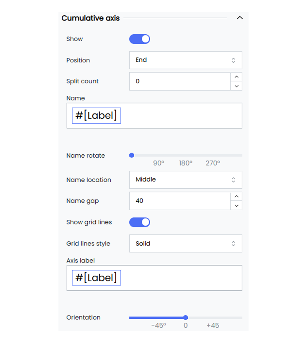
Infoveave provides the following customization options for the cumulative axis of your Pareto chart.
**Show** Enable or disable the display of the cumulative axis. When enabled, the cumulative axis will be visible in your widget.
**Position** Choose the position of the cumulative axis, for example, Start or End.
**Split count** Set the split count between axis labels as Auto, 0, 1, 2, and so on. Choose Auto for automatic spacing of your axis labels.
**Name** Give a name for the axis. By default, the axis name is set to #[Label].
* You can remove the #[Label] and replace it with a name of your choice.
* Select the name #[Label] to access options for positioning it or setting font customization.
**Name rotate** Rotate the axis name by a specified degree using the slider provided.
**Name location** Set the location of the axis name to Start, Middle, or End.
**Name gap** Define the gap between the axis line and its name, for example, 20 pixels.
**Show grid lines** Enable or disable the display of the grid lines on the cumulative axis. When enabled, the grid lines will be visible in your widget.
**Grid line style** Select the grid line style as solid, dotted, or dashed from the drop-down options.
**Axis label** Enter a name for the axis label. By default, the axis label is set to #[Label].
* You can remove the #[Label] and replace it with an axis label of your choice.
* Select the axis label #[Label] to access options for positioning it or setting font customization.
**Orientation** Rotate the orientation of the axis labels by a specified degree using the slider provided.
#### Axis Line

Customize the axis lines by setting their color, width, and type. You can also add symbols at the beginning or the end of the axis.
Below are the available options.
**Axis line** Enable or disable the axis line option.
**Axis begin symbol** Choose a symbol to display at the beginning of the axis. Options include Arrow, Circle, Triangle, Diamond, or Pin.
**Axis end symbol** Choose a symbol to display at the end of the axis. Options include Arrow, Circle, Triangle, Diamond, or Pin.
**Axis line color** Set the color of the axis line (e.g., #333333).
**Size perpendicular to axis** Set the size of the axis begin symbol (e.g., 10 pixels).
**Size parallel to axis** Set the size of the axis end symbol (e.g., 10 pixels).
**Axis line width** Define the width of the axis line (e.g., 1 pixel).
**Axis line type** Choose the line type for the axis line as Solid, Dashed, or Dotted.
## Cumulative Line
Customizing the cumulative line of a Pareto chart helps you enhance the readability and appearance of the chart. Common customization options for the cumulative line in a Pareto chart include adjusting its visibility, position, and scale.
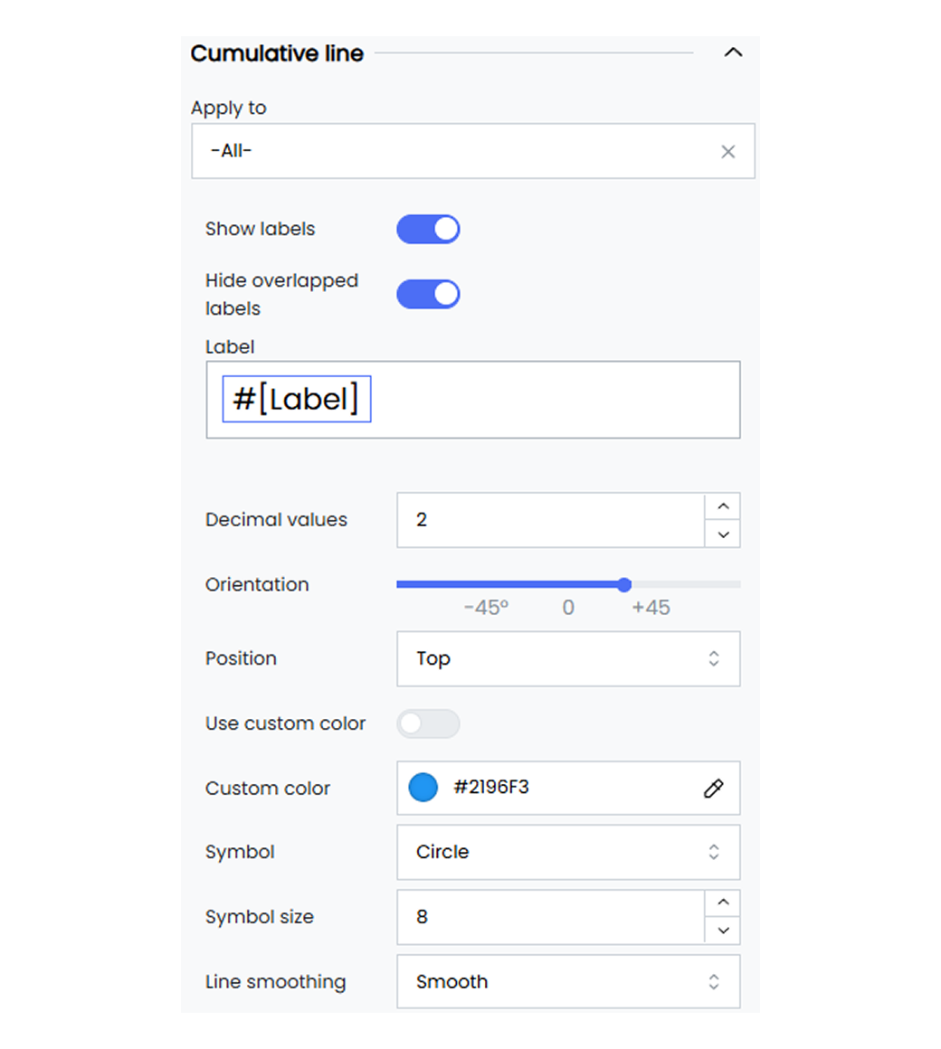
The cumulative line customization option in your widgets allows you to adjust how data is presented. It helps you customize the widget values and the widget type style.
Below are the customization options available for the cumulative line in Infoveave.
**Apply to** Select the specific value to apply these settings to. You can choose All to apply the settings to all dimension values. To apply the customization to a single dimension value, select the required dimension value from the drop-down.
**Show labels** Toggle to enable or disable the display of data labels on the line.
**Hide overlapped labels** Toggle the option to automatically hide labels that overlap to ensure clarity. This option is enabled by default.
**Label** Customize the text for the data labels. You can replace the default #[Label] with custom text by replacing #[Label] with your text. You can also replace #[Label] with:
**Measures** Displays the measure value of the data point, showcasing the data.
**Dimensions** Shows the dimension names on the cumulative line.
**Decimal values** Set the number of decimal points to be shown for the percentage contribution values over the cumulative line.
**Orientation** Set the orientation of the series using the slider.
**Position** Choose the position of the series labels, such as Top, Bottom, Left, or Right.
**Use custom color** Toggle to apply a custom color for the series. Use the custom color picker to select a color (e.g., #2196F3).
**Symbol** Select the symbol for the data value pointer on the cumulative line from the available options.
**Symbol size** Define the size of the symbol used on the cumulative line to showcase the data point.
**Line smoothing** Select the line style as smooth, step, or normal from the available options.
**Line step** When line smoothing is set to step, define the line step style as start, end, or middle.
**Line type** Select the line type as solid, dotted, or dashed from the drop-down options.
**Connect nulls** Enable or disable the option to connect the null values in the chart.
## Gauge Measure
Gauge measure customization gives you options to set the customization for the measure label, the progress bar, the pointer, and the pointer anchor. These customization options allow you to showcase your datapoints and track the progress of the measure value. You can apply the customization options as a whole or to individual measures.
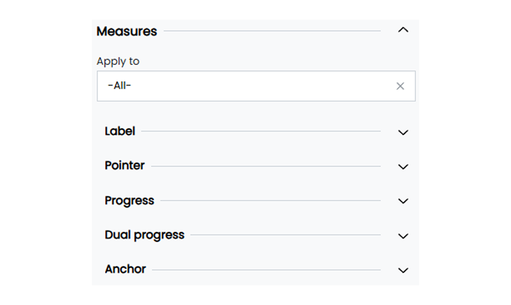
Customize the gauge measure labels to enhance the visibility of datapoints in your widget.
#### Label
Below are the customization options available for the gauge measure label in Infoveave.
**Custom offset** Enable or disable the custom positioning option for the measure labels.
**Label offset horizontal** Set the horizontal offset value for the measure label (e.g., 10).
**Label offset vertical** Set the vertical offset value for the measure label (e.g., 20).
**Round cap** Enable or disable the round cap for the gauge. This determines if the ends of the gauge are rounded.
**Label** Apply customization to the gauge measure label values by selecting the #[Label] option.
#### Gauge Pointer
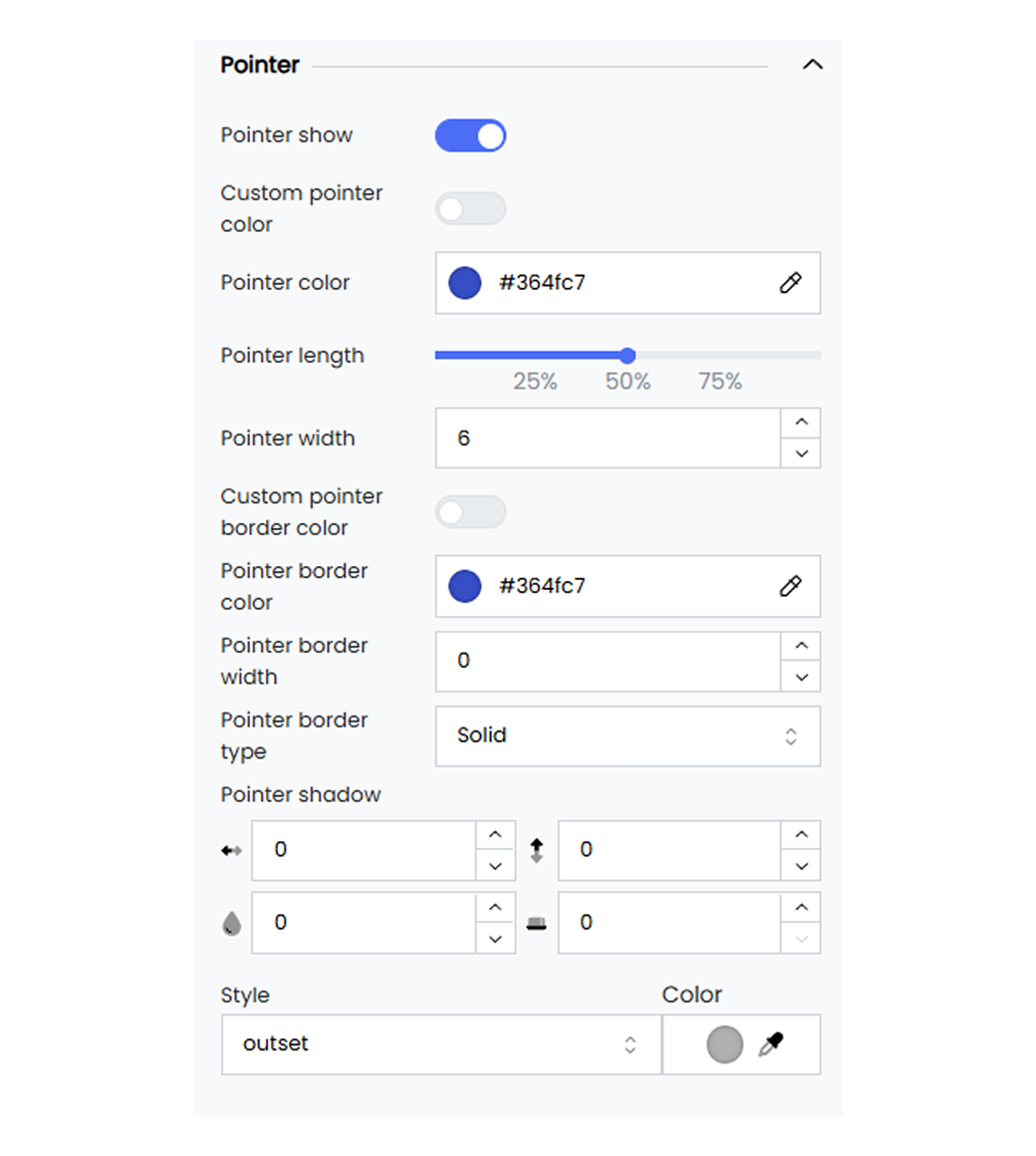
Apply customization to the gauge widget pointer such as customizing the thickness, length, color, and pointer type.
Below are the customization options available for the gauge pointer in Infoveave.
**Pointer show** Enable or disable the pointer in your gauge widget.
**Custom pointer color** Enable or disable the pointer color option to apply custom colors to your gauge pointer.
**Pointer color** Apply a custom color to the gauge pointer widget by selecting the color of your choice with the color picker.
**Pointer length** Set a custom length for your widget pointer using the slider option.
**Pointer width** Set a custom width for your widget pointer.
**Custom pointer border color** Enable or disable the pointer border color option to apply custom colors to your gauge pointer border.
**Pointer border color** Apply a custom color to the gauge pointer border by selecting the color of your choice with the color picker.
**Pointer border width** Set a custom border width for your widget pointer.
**Pointer border type** Define custom border types for your widget pointer as Solid, Dotted, or Dashed.
**Pointer shadow** Apply the shadow effect to the gauge pointer by defining the values for horizontal, vertical, blur, and spread.
**Pointer shadow style** Apply the gauge pointer shadow style as inset or outset. Pick the shadow color using the associated color picker option.
#### Gauge Progress
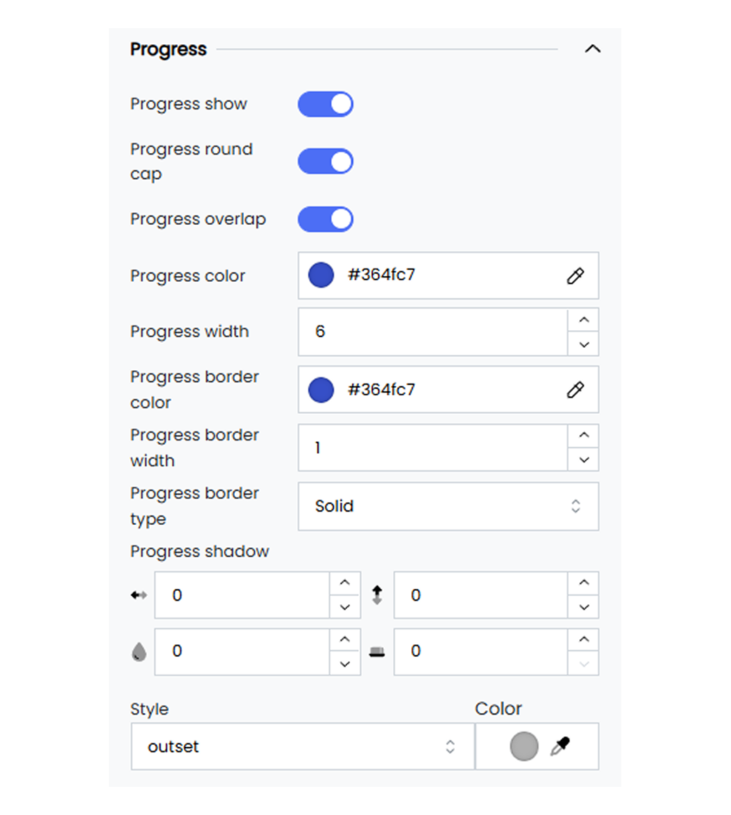
Add a custom progress bar to your gauge chart to visually track the progress of the datapoints towards the target value.
Below are the customization options available for the gauge progress in Infoveave.
**Progress show** Enable or disable the progress track in your gauge widget.
**Process round cap** Enable or disable the round capping for your progress track.
**Progress overlap** Enable or disable the progress overlap option to set the progress tracker to the gauge width.
**Progress color** Apply a custom color to the gauge pointer border by selecting the color of your choice with the color picker.
**Progress width** Set a custom width for your widget progress tracker.
**Progress border color** Apply custom colors to your gauge progress border with the custom color picker.
**Pointer border width** Set a custom border width for your progress tracker.
**Pointer border type** Define custom border types for your progress tracker as Solid, Dotted, or Dashed.
**Progress shadow** Apply the shadow effect to the gauge progress tracker by defining the values for horizontal, vertical, blur, and spread.
**Pointer shadow style** Apply the gauge progress shadow style as inset or outset. Pick the shadow color using the associated color picker option.
#### Gauge Anchor
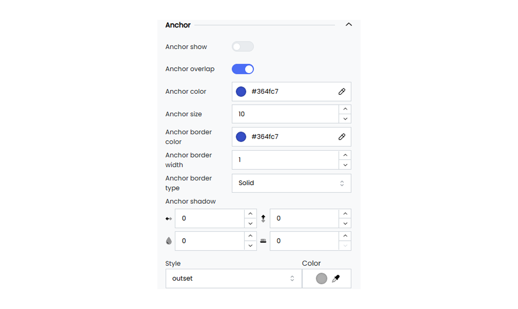
Customize your gauge pointer anchor to enhance the anchor visibility. This includes defining the anchor size, the color, and the border width.
Below are the customization options available for the gauge anchor in Infoveave.
**Anchor show** Enable or disable the anchor pointer in your gauge widget.
**Anchor overlap** Enable or disable the overlapping functionality of the anchor pointer when using multiple measure values while configuring the gauge widget.
**Anchor color** Apply a custom color to the gauge pointer anchor by selecting the color of your choice with the color picker.
**Anchor size** Set a custom size for your pointer anchor in the gauge widget.
**Anchor border color** Set the anchor border color option to apply custom colors to your gauge anchor border.
**Anchor border width** Apply custom widths to your gauge anchor border with the custom color picker.
**Anchor border type** Define custom border types for your anchor as Solid, Dotted, or Dashed.
**Progress shadow** Apply the shadow effect to the gauge progress tracker by defining the values for horizontal, vertical, blur, and spread.
**Anchor shadow style** Apply the gauge pointer anchor shadow style as inset or outset. Pick the shadow color using the associated color picker option.
## Gauge Series
Gauge series customization in Infoveave allows you to define the appearance and functionality of your gauge widgets. Gauge series customization gives you options to set minimum and maximum values, adjust the gauge radius, define intervals, and apply various styling elements.

Customize the gauge series in your widgets to control the gauge’s appearance and behavior.
Below are the customization options available for gauge series in Infoveave.
**Minimum** Set the minimum value for the gauge (e.g., 0).
**Maximum** Set the maximum value for the gauge (e.g., 1000).
**Radius** Set the radius value for the gauge as a percentage using the slider option.
**Round cap** Enable or disable the round cap for the gauge. This determines if the ends of the gauge are rounded.
**Intervals** Define the intervals within the gauge to represent different ranges of values. Each interval includes
* **Min** The starting value of the interval.
* **Max** The ending value of the interval.
* **Color** The color used to represent the particular interval.
**Gauge Width** Adjust the width of the gauge (e.g., 10).
**Shadow** Define the shadow for the gauge, with settings for horizontal and vertical offsets, blur radius, and spread.
**Style** Choose the shadow style of the gauge (e.g., outset).
**Color** Select the shadow color for the gauge.
#### Gauge Axis
Customize the gauge axis ticks and the label values in your gauge widget to enhance visibility.
Below are the customization options available for the gauge axis in Infoveave.
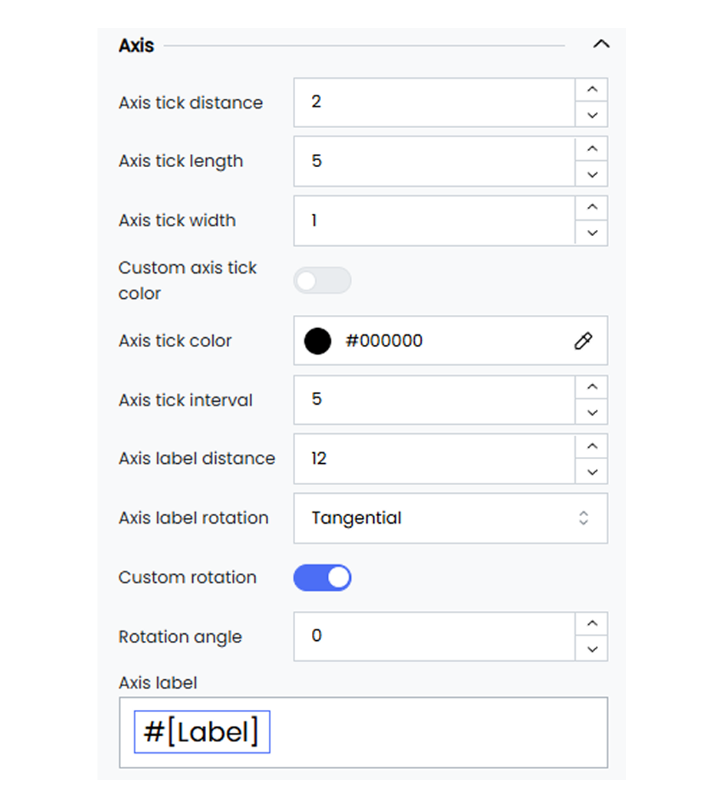
**Axis tick distance** Set the value for the axis tick distance from the gauge (e.g., 2).
**Axis tick length** Set the length for the axis tick (e.g., 5).
**Axis tick width** Set the minimum width for axis ticks (e.g., 1).
**Custom axis tick color** Enable or disable the custom axis tick color for your gauge widget.
**Axis tick color** Pick any custom color for the axis tick using the color picker.
**Axis tick intervals** Specify the interval value between the gauge axis tick lines (e.g., 5).
**Axis label distance** Set the value for the axis label distance from the gauge (e.g., 2).
**Axis label rotation** Set the rotation style for the axis label distance, for example, Tangential or Radial.
**Custom rotation** Enable the custom rotation option for the axis label.
**Rotation angle** Set the rotation angle value for the axis label.
**Axis label** Select #[Label] to customize the axis label name.
#### Gauge Axis Split Line
Customize the gauge axis split line option in your gauge widget to enhance visibility on the gauge axis intervals.
Below are the customization options available for the gauge axis split line in Infoveave.
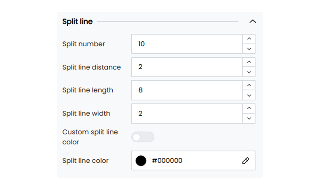
**Split number** Set the split value for the gauge axis. The split value helps you divide the total axis range into equal intervals (e.g., 10).
**Split line distance** Set the distance for the split line from the gauge axis tick lines (e.g., 5).
**Split line length** Set the minimum length for split lines in the gauge axis (e.g., 2).
**Split line width** Set the minimum width for split lines in the gauge axis (e.g., 2).
**Custom split line color** Enable the custom color option for the split line.
**Split line color** Select a custom color for the split line using the color picker.
#### Gauge Target
Define and customize the target value of your gauge widget and track its progress.
Below are the options available for the gauge target in Infoveave.
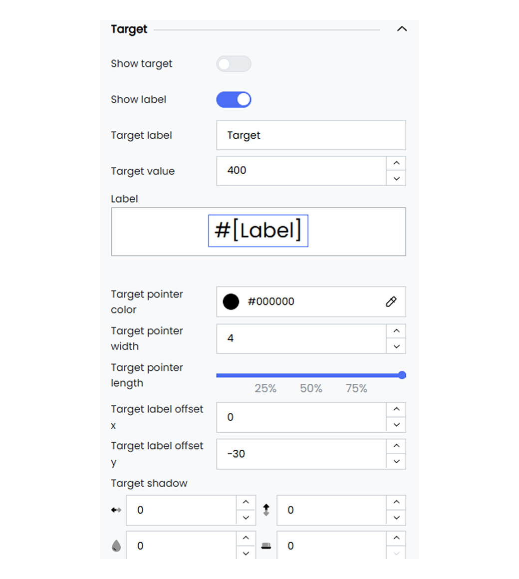
**Show target** Enable or disable the target option on your gauge widget.
**Target** Define the target value for your gauge widget (e.g., 400).
**Target color** Define the color for the target line using the color picker.
**Target width** Set the minimum width for target lines in the gauge axis (e.g., 2).
**Target length** Set the minimum length for target lines in the gauge axis using the slider option.
**Target label size** Specify the minimum size for the target label in the gauge axis (e.g., 20).
**Target label color** Define the color for the target label using the color picker.
**Target label offset X** Set the target label position along the horizontal axis.
**Target label offset Y** Set the target label position along the vertical axis.
**Target shadow** Apply the shadow effect to the target line by defining the values for horizontal, vertical, blur, and spread.
**Shadow style** Apply the target line shadow style as inset or outset. Pick the shadow color using the associated color picker option.
**Target icon** Select the target line style from the available options such as Rectangle, Pin, Circle, Arrow, and Diamond.
## Grid
The grid option allows you to define the boundaries of your widget, enabling precise positioning within the available space. These options include adjusting margins, containing labels within the grid, and customizing the border color and width.
Infoveave allows you to customize the grid layout of your widgets to enhance the overall design and functionality of your Infoboard. Here are the options available for grid customization.
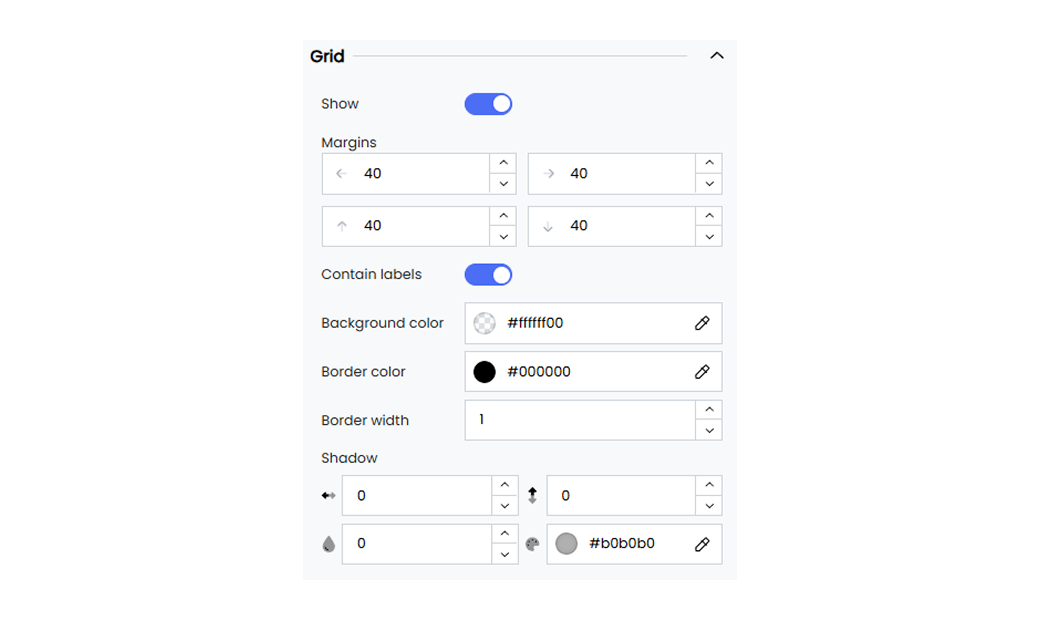
**Show** Enable or disable the display of the grid. When enabled, the grid boundaries become visible, providing a structured layout for your widget.
**Margins** Set the margin for your widget to ensure it is properly contained within the grid.
**Contain labels** Enable the contain labels option to ensure that labels stay within the grid. This prevents labels from extending beyond the widget boundaries.
**Background color** Choose the background color for the grid.
**Border color** Set the color of the grid borders using a hex color code. For example, use #000000 for black.
**Border width** Set the width of the grid borders. For example, a value of 2 sets a border that is 2 pixels wide.
**Shadow** Add a shadow to your grid.
## Legend
Customize the legend in your widgets to enhance the clarity of your data visualizations. Customizing the legend makes it easier to understand and interpret the information presented in your widgets. It ensures that your legend remains easily readable and is positioned optimally within your widget.
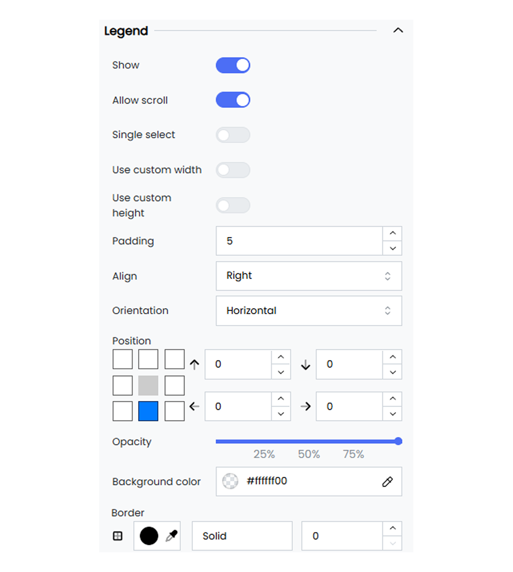
Basic legend customization options allow you to set the position, orientation, and item gaps. You can also enable single selection and scrolling for improved interactivity and usability.
Below are the available options and their descriptions.
**Single select** Enable or disable the ability to select only one legend item at a time.
**Position** Set the position of the legend by defining the top, right, bottom, and left margins. For example, 0, 0, 0, 0.
**Show legend** Enable or disable the display of the legend.
**Allow scroll** Enable scrolling if the legend items exceed the available space.
**Orientation** Set the orientation of the legend. For example, vertical or horizontal.
**Item gap** Define the gap between legend items. For example, 2 pixels.
## Heatmap
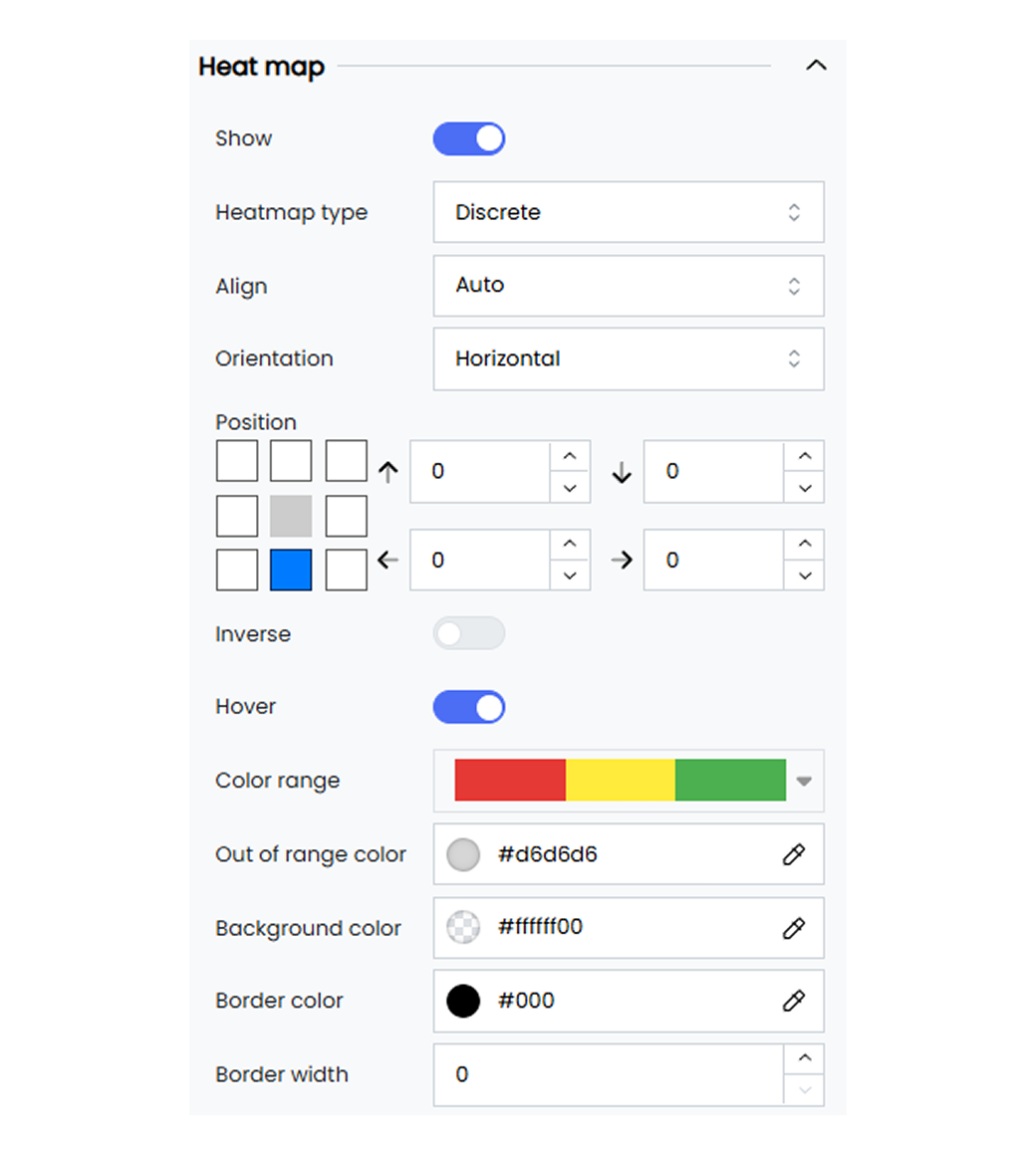
Heatmap legend options help you understand the data intensity and distribution effectively. They provide a clear view of the data patterns. Heatmap legend customization options include defining the color ranges and the steps.
Below are the available options and their descriptions.
**Enable** Enable or disable the heatmap by selecting the option Heatmap from Show Legend under Basic.
**Heatmap type** Choose the type of heatmap legend. For example, discrete.
**Inverse** Invert the color scale of the heatmap legend.
**Steps** Set the number of steps or intervals in the heatmap legend.
**Min** Define the minimum value for the heatmap legend.
**Max** Define the maximum value for the heatmap legend.
**Color** Set the color corresponding to the value on the heatmap scale. For example, rgba(0, 0, 0, 1).
**Color range** Define the range of colors used in the heatmap legend.
**Out of range color** Set the color for values outside the defined range. For example, #d6d6d6.
## Numerical Axis
Customize the numerical axis to tailor the appearance of your widget’s numerical axis so it better suits your data visualization needs. The customization options include hiding the display of the axis, setting the positioning, and adjusting label intervals. These options ensure your data is presented effectively.
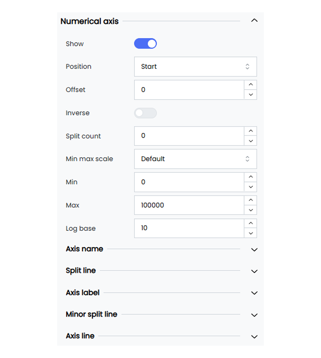
Infoveave’s numerical axis customization allows you to tailor the axis to match your visualization needs. Below are the available options and how you can use them.
**Show** Toggle to enable or disable the display of the numerical axis. When enabled, the numerical axis becomes visible in your widget.
**Position** Choose the position of the categorical axis. For example, start or end.
**Inverse** Toggle this option to invert the axis direction.
**Interval** Set the interval between axis labels. Choose Auto for automatic spacing.
**Name** Enter a name for the axis. By default, the axis name is set to #[Label].
You can remove #[Label] and enter the name of your choice. Select the name to position it or to apply font customization.
**Name rotate** Rotate the axis name by a specified degree using the slider option.
**Name location** Set the location of the axis name. For example, start, middle, or end.
**Name gap** Define the gap between the axis line and its name. For example, 20 pixels.
**Show grid lines** Enable this to show grid lines in your widget.
**Grid lines style** Select the grid line style from the dropdown. For example, solid, dashed, or dotted.
**Axis label** Enter a name for the axis label. By default, the axis label is set to #[Label].
You can remove #[Label] and enter the label of your choice. Select the label to position it or to apply font customization.
**Orientation** Rotate the orientation of the axis labels by a specified degree using the slider option.
**Min Max scale** Choose the scale setting for the axis. For example, default, data, or custom.
When you choose data, the axis resizes to fit the data points.
When you choose custom, define the minimum and maximum axis values to display your data.
- **Min** Set the minimum value for the axis. For example, 0.
- **Max** Set the maximum value for the axis. For example, 100000.
**Log base** Set the logarithmic base for the axis. For example, 10.
#### Slider

Use the slider to enhance interactivity in your widget. The slider allows you to easily focus on specific data ranges. You can enable range sliders, adjust their size, thickness, and position, set colors, and even enable inside zoom functionality.
**Show range slider** Enable the range slider to allow interactive range selection.
**Slider size** Define the size of the slider using the sliders.
**Slider thickness** Set the thickness of the slider. For example, 25 pixels.
**Slider move handle size** Adjust the size of the slider’s move handle. For example, 10 pixels.
**Slider position** Set the position of the slider using the position marker or input values. For example, 0, 20, 0, 10.
**Slider background color** Set the background color of the slider. For example, #ffffff00.
**Slider selected area color** Define the color of the selected area in the slider. For example, #87afff33.
**Slider move handle color** Set the color of the slider’s move handle. For example, #9dc9fc.
**Inside zoom** Enable the inside zoom functionality for the slider.
#### Axis Line

Customize the appearance of axis lines by setting their color, width, and type. You can also add symbols at the beginning or end of the axis.
**Axis line** Enable or disable the axis line.
**Axis begin symbol** Choose a symbol to display at the beginning of the axis. Options include arrow, circle, triangle, diamond, or pin.
**Axis end symbol** Choose a symbol to display at the end of the axis.
**Axis line color** Set the color of the axis line. For example, #333333.
**Size perpendicular to axis** Set the size of the axis begin symbol. For example, 10 pixels.
**Size parallel to axis** Set the size of the axis end symbol. For example, 10 pixels.
**Axis line width** Define the width of the axis line. For example, 1 pixel.
**Axis line type** Choose the line type for the axis. Options include solid, dashed, or dotted.
## Parallel Axis
Parallel axis customization allows you to tailor the appearance of the parallel axis in your chart to better suit your data visualization needs.
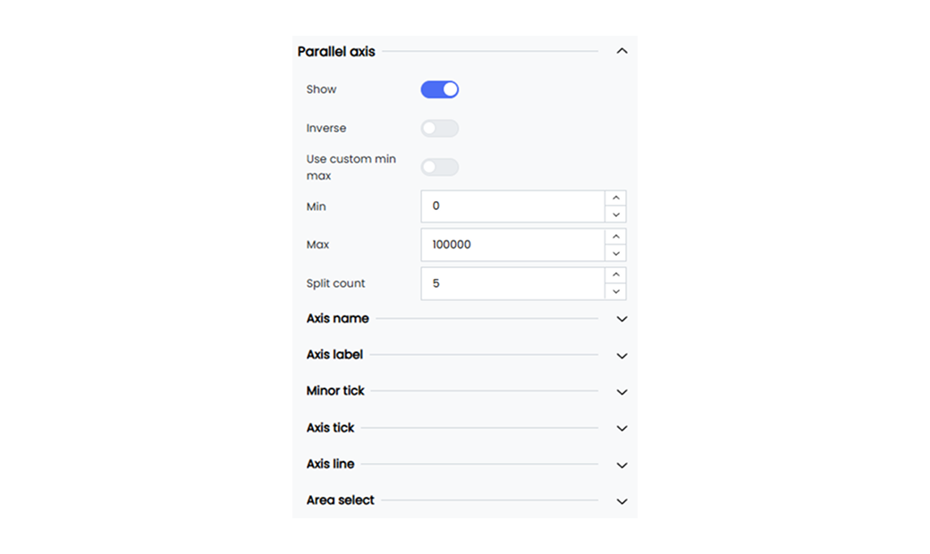
Infoveave provides the following customization options for the parallel axis in your chart.
**Show** Enable or disable the display of the parallel axis for your parallel axis chart. When enabled, the parallel axis becomes visible in your widget.
**Inverse** Invert the display of the parallel axis name for your chart. When enabled, the parallel axis name is inverted.
**Use custom min max** Enable or disable custom min max values for the parallel axis. When enabled, you can define the minimum and maximum scale for your chart.
**Split count** Set the number of split ranges required in the parallel axis of your chart.
#### Axis Label
**Axis label** Enter a name for the axis label. By default, the axis label is set to #[Label].
You can remove #[Label] and replace it with a label of your choice.
Select the label to position it or to apply font customization.
**Align** Set the alignment for the parallel axis values. Choose left, center, or right from the dropdown.
**Vertical alignment** Set the vertical alignment for the parallel axis values. Choose top, middle, or bottom from the dropdown.
**Orientation** Set the orientation for the parallel axis values using the slider option.
#### Axis Line

You can customize the axis lines by setting their color, width, and type, and by adding symbols at the beginning or the end.
Below are the available options.
**Axis line** Enable or disable the axis line option.
**Axis begin symbol** Choose a symbol to display at the beginning of the axis. You can select Arrow, Circle, Triangle, Diamond, or Pin.
**Axis end symbol** Choose a symbol to display at the end of the axis. You can select Arrow, Circle, Triangle, Diamond, or Pin.
**Axis line color** Set the color of the axis line. For example, #333333.
**Size perpendicular to axis** Set the size of the axis begin symbol. For example, 10 pixels.
**Size parallel to axis** Set the size of the axis end symbol. For example, 10 pixels.
**Axis line width** Define the width of the axis line. For example, 1 pixel.
**Axis line type** Choose the line type for the axis line. You can select Solid, Dashed, or Dotted.
---
## Position
The position control option under widget customization allows you to adjust the widget position within the chart area. The horizontal and vertical slider controls let you place the widget precisely in alignment with other charts in the Infoboard.
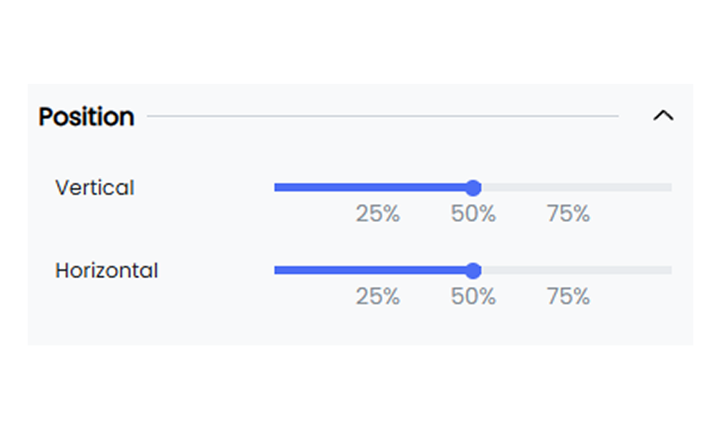
Explore how to effectively use the position control options in widgets. Below are the available options.
**Vertical** Use the slider to move the chart vertically within the chart area.
**Horizontal** Use the slider to move the chart horizontally within the chart area.
---
## Radar Axis
Radar axis customization allows you to modify the appearance of your radar chart’s axis to suit your visualization needs. You can enable the axis display, axis names, and split lines to ensure your data is presented clearly through the widget.
#### Axis Label
Below are the customization options available for the axis label of your radar chart.
**Show** Enable or disable the display of the categorical axis. When enabled, the categorical axis is visible on your widget.
**Axis label** Enter a name for the axis label. By default, the axis label is set to #[Label].
- You can remove the #[Label] and replace it with a name of your choice.
- Select the axis label #[Label] to position it or to customize the font.
**Orientation** Rotate the orientation of the axis labels using the slider.
#### Axis Name
Below are the customization options available for the axis name of your radar chart.
**Show** Enable or disable the display of the categorical axis. When enabled, the categorical axis is visible on your widget.
**Axis label** Enter a name for the axis label. By default, the axis label is set to #[Label].
- You can remove the #[Label] and replace it with a name of your choice.
- Select the axis label #[Label] to position it or to customize the font.
**Radius** Use the slider to set the radius of the radar chart.
**Rotation** Use the slider to set the rotation of the radar chart.
**Shape** Select the radar shape from the drop-down. Options include Polygon and Circle.
**Split number** Set the number of axis line splits for a more detailed radar chart analysis.
#### Axis Line
Customize the axis lines by setting their color, width, and type, and by adding symbols at the beginning or the end.
Below are the available options.
**Axis line** Enable or disable the axis line option.
**Axis begin symbol** Choose a symbol to display at the beginning of the axis. Options include Arrow, Circle, Triangle, Diamond, or Pin.
**Axis end symbol**
Choose a symbol to display at the end of the axis. Options include Arrow, Circle, Triangle, Diamond, or Pin.
**Axis line color** Set the color of the axis line. For example, #333333.
**Size perpendicular to axis** Set the size of the axis begin symbol. For example, 10 pixels.
**Size parallel to axis** Set the size of the axis end symbol. For example, 10 pixels.
**Axis line width** Define the width of the axis line. For example, 1 pixel.
**Axis line type** Choose the line type for the axis line. Options include Solid, Dashed, or Dotted.
#### Split Line
Customize the axis split lines by setting their color, width, and type.
Below are the available options.
**Split line** Enable or disable the axis split line option.
**Split line color** Select the split line color using the color picker.
**Split line width** Define the width of the split line.
**Split line type** Choose the split line style. Options include Solid, Dotted, or Dashed.
---
## Radius Axis
Radius axis customization allows you to modify the appearance of the radius axis in your polar chart. The customization options include enabling the axis display, axis names, and axis lines to present your data clearly through the widget.
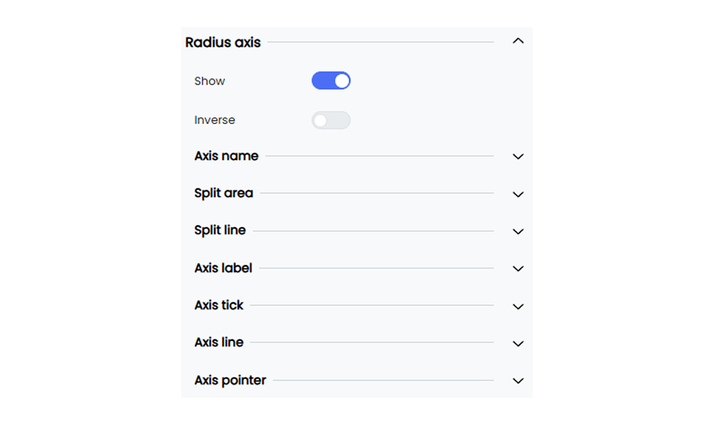
Below are the customization options available for the radius axis of your polar chart.
**Show** Enable or disable the display of the radius axis. When enabled, the radius axis is visible on your widget.
**Inverse** Invert the display of the radius axis name. When enabled, the axis name is displayed in reverse.
#### Axis Line

You can customize the axis lines by setting their color, width, and type, and by adding symbols at the beginning or the end.
Below are the available options.
**Axis line show** Enable or disable the axis line option.
**Axis begin symbol** Choose a symbol to display at the beginning of the axis. Options include Arrow, Circle, Triangle, Diamond, or Pin.
**Axis end symbol** Choose a symbol to display at the end of the axis. Options include Arrow, Circle, Triangle, Diamond, or Pin.
**Axis line color** Set the color of the axis line. For example, #333333.
**Size perpendicular to axis** Set the size of the axis begin symbol. For example, 10 pixels.
**Size parallel to axis** Set the size of the axis end symbol. For example, 10 pixels.
**Axis line width** Define the width of the axis line. For example, 1 pixel.
**Axis line type** Choose the line type for the axis line. Options include Solid, Dashed, or Dotted.
---
## Scatter Single Axis
Scatter single axis customization allows you to modify the appearance of your chart’s single axis. The customization options include enabling the inverse option, setting intervals, and customizing axis labels and orientations to ensure clear data presentation through the widget.
#### Axis
Below are the customization options available for the scatter single axis of your chart.
**Show** Enable the show toggle.
**Position** Select the axis position. You can choose between Start and End.
**Inverse** Invert the display of the radius axis name. When enabled, the axis name is displayed in reverse.
**Split count** Set the interval value for the axis labels. When set to 0, all axis label values are displayed.
#### Axis Line

Customize the axis lines by setting their color, width, and type, and by adding symbols at the beginning or the end.
Below are the available options.
**Axis line** Enable or disable the axis line option.
**Axis begin symbol** Choose a symbol to display at the beginning of the axis. Options include Arrow, Circle, Triangle, Diamond, or Pin.
**Axis end symbol** Choose a symbol to display at the end of the axis. Options include Arrow, Circle, Triangle, Diamond, or Pin.
**Axis line color** Set the color of the axis line. For example, #333333.
**Size perpendicular to axis** Set the size of the axis begin symbol. For example, 10 pixels.
**Size parallel to axis** Set the size of the axis end symbol. For example, 10 pixels.
**Axis line width** Define the width of the axis line. For example, 1 pixel.
**Axis line type** Choose the line type for the axis line. Options include Solid, Dashed, or Dotted.
## Series
The **Series** option in your Infoveave widgets allows you to control the appearance and behavior of data points. This enhances both clarity and visual appeal. The customization options provide flexibility in label display, color schemes, orientation, and style. This allows you to create tailored visualizations to effectively communicate data insights.
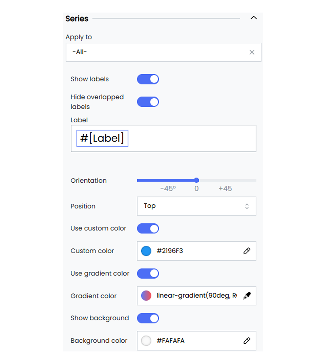
The series customization option in your widgets allows you to adjust how data is presented. It helps you customize the widget values and the widget type style.
Below are the customization options available for series in Infoveave.
**Apply to** Select the specific series to which you want to apply these settings. You can choose **All** to apply the settings to all Dimension values. To apply the series customization option to a single dimension value, select the required dimension value from the drop-down.
**Show labels** Toggle to enable or disable the display of data labels on the series.
**Hide overlapped labels** Toggle this option to automatically hide labels that overlap to ensure clarity. This option is set to **ON** by default.
**Label** Customize the text for the data labels. You can replace the default #[Label] option with custom text by replacing #[Label] with your own. You can also replace #[Label] with:
**#[Axis]** This replaces the label with the value from the specified axis, providing context about the data point’s category.
**#[Value]** This displays the numerical value of the data point, showcasing the data.
**#[Percentage]** This shows the data point as a percentage to help visualize proportions within the dataset.
**#[Split]** This represents the split of the data point.
**#[Group]** This displays the group or category to which the data point belongs.
**Orientation** Set the orientation of the series. For example, Vertical or Horizontal.
**Position** Choose the position of the series labels. For example, Top, Bottom, Left, or Right.
**Use custom color** Toggle this option to apply a custom color to the series. Use the custom color picker to select a custom color for the series. For example, #2196F3.
**Use gradient color** Toggle this option to enable the use of a gradient color for the series.
**Show background** Toggle to enable or disable the background for the series.
**Bar gap** Adjust the gap between bars in the series.
**Bar category gap** Adjust the gap between categories of bars in the series.
**Border radius** Set the border radius for the series bars to create rounded corners. For example, 10, 10, 10, 10.
**Box shadow** Define the box shadow for the series bars. For example, 0, 0, 0, 0.
**Style** Choose the style of the series bars. For example, Inset or Outset.
## Table
The **Table** option allows you to set table customizations and enhance data visibility for your widgets. These customization options let you set the theme, show total values, show a table summary, and change the cell border width.
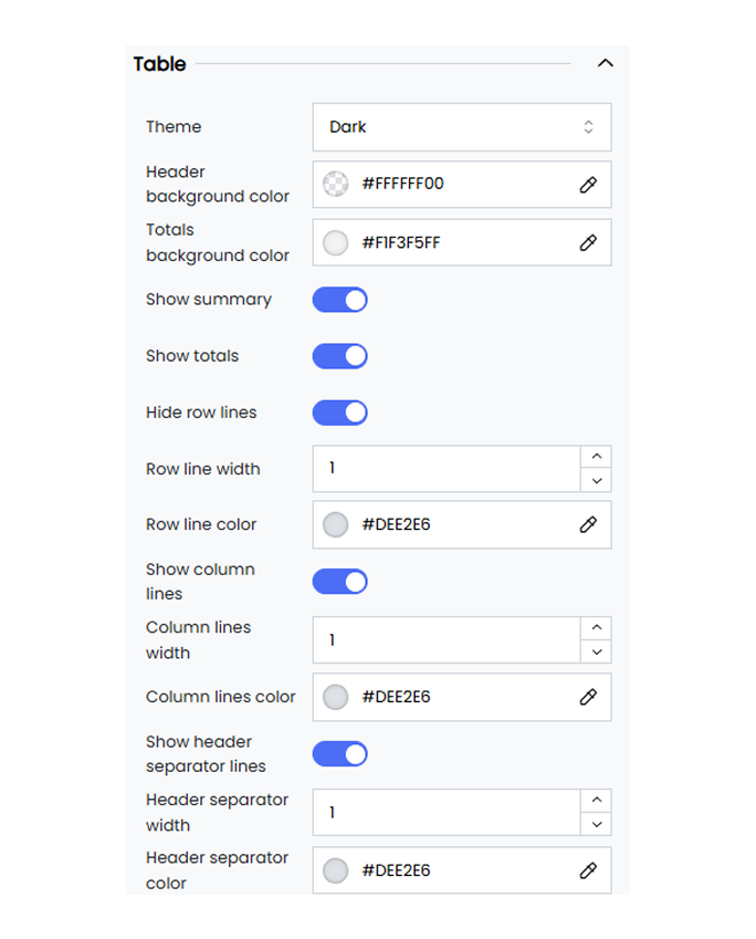
Below are the customization options available for the table in Infoveave.
**Theme** Choose between the available light and dark themes to match your preferred visual style.
**Header background color** Set the background color of the header section of the table widget.
**Totals background color** Define the background color for the **Show totals** option.
**Show summary** Toggle this option to display or hide the summary row. The customization options for the summary are available under the **Columns** option.
**Show totals** Toggle this option to display or hide the totals row.
**Hide row lines** Enable this option to hide the lines between rows.
**Row line width** Set the width of the row lines. For example, a value of 3 sets the line width to 3 pixels.
**Row line color** Define the color of the row lines using a color code or the color picker.
**Show column lines** Toggle this option to show or hide the lines between columns.
**Column lines width** Set the width of the column lines. For example, a value of 1 sets the line width to 1 pixel.
**Column lines color** Define the color of the column lines using a color code or the color picker.
**Show header separator lines** Toggle this option to show or hide the separator lines in the header.
**Header separator width** Set the width of the header separator lines. For example, a value of 1 sets the line width to 1 pixel.
**Header separator color** Define the color of the header separator lines using a color code.
## Tool tip
The **Tool tip** in Infoveave allows you to provide clear and visually appealing data insights when you hover over data points. With a variety of options to adjust font styles, colors, behavior, and positioning, you can tailor the tooltip to improve data interpretation.
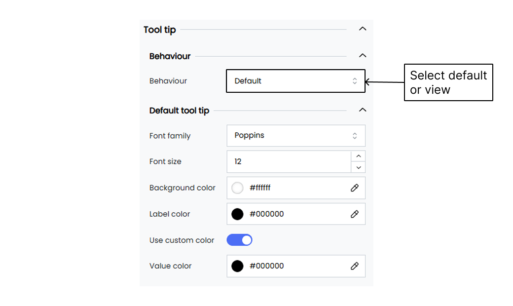
Below are the customization options available for tooltips in Infoveave.
**Behaviour** Set the tooltip behaviour. For example, Default or Sub View.
**Font Family** Select the font family for the tooltip text. For example, Poppins.
**Font Size** Choose the font size for the tooltip text. For example, 12.
**Background Color** Select the background color for the tooltip. For example, #be4bdb.
**Label Color** Choose the color for the tooltip labels. For example, #FFFFFF.
**Use Custom Color** Enable or disable the use of custom colors for the tooltip value.
**Value Color** Select the color for the values displayed in the tooltip. For example, #FFFFFF.