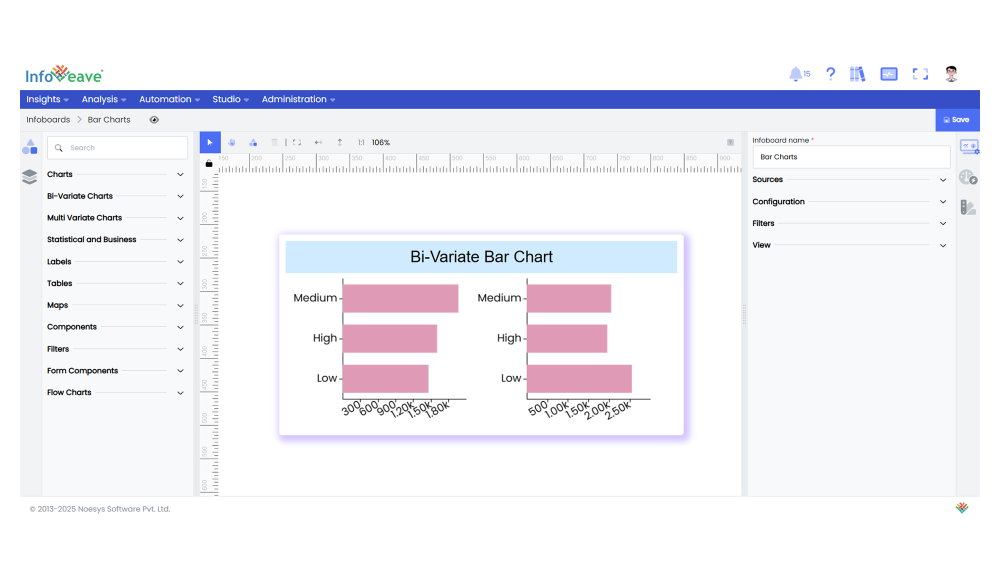
Bi-Variate Bar
A BiVariate Bar Chart is a powerful extension of a standard horizontal bar chart, designed for comparing multiple split groups across categories. It can render one or more grids side by side (or in a grid layout), each showing a subset of data segmented by a Split dimension. Optionally, a Group dimension can be added to stack or cluster bars within each category.
Use Cases:
- Visualizing survey responses split by demographic groups across regions.
- Department-wise comparison of budget allocations by fiscal year.
- Market share distribution for different product lines split by geography.
- Metric breakdown by teams within multiple business units.
⚙️ Setup
- Drag the BiVariate Bar Chart widget from the chart library onto your designer workspace.
- Select the chart.
- Go to the Widget Configuration tab in the Configuration panel.
- Under the Configuration panel tab, select the Basic Configuration option to access the essential settings for the bi variate bar chart.
- Select the Source which the chart will pull the data from the option.
- Map:
- Measure (Value) — The numeric metric to be displayed as bar length.
- Dimension (Axis) — The categorical value for the Y-axis.
- Dimension (Split) — The dimension to split charts into multiple grids (e.g. region, year).
- Group (Dimension) — (Optional) A second category to stack or group bars inside each panel.
- Optionally add a Date field for time-based filtering.
- Enable Hide Zero Values to omit symbols with zero values if needed.
📊 Basic Configuration
| Configuration Item | Description |
|---|---|
| Source | Source providing the data for measures and dimensions. |
| Measure (Value) | Numeric measure displayed as bar length. |
| Dimension (Axis) | Categorical label for each bar (Y-axis). |
| Dimension (Split) | Splits data into multiple grids/panels. |
| Group (optional) | Second categorical dimension to group/stack bars within a panel. |
🎨 Chart Customizations
| Category | Options & Description |
|---|---|
| General | Modify the chart’s general appearance, including the background color, borders, shadows, and drill-out choices. |
| Title | Enable and customize chart title text, alignment, font, and color. |
| Sorting | Set sort order for Axis values. |
| Grid | Adjust chart margins, grid spacing, and padding around the matrix area. |
| Legend | Toggle visibility, position, orientation, and customize legend labels and icons. |
| HeatMap | Configure a visual color map to represent value intensity with a gradient. |
| Categorical Axis | Customize axis labels, intervals, rotation, visibility, and range sliders for both axes. |
| Numerical Axis | Set axis type, scale (linear/log), and formatting. |
| Series | Customize bar width, color schemes, shadows, and stacking behavior. |
| Tooltip | Control tooltip content, formatting, and visibility on hover. |
| Others | Stack bars, apply custom colors to single-series mode, control border radius, and box shadows. |
📊 Example Visualization